Feeds:
Posts
Comments

Archive for the ‘Designs From Merlin Drive’ Category

If you really want something special and unique in your home than decorative painting is the way to go. In many Designer showhouses you’ll find the work of talented artists that use decorative painting techniques.

The origin of decorative paint is unknown, it has been seen as far back as cave paintings. The greatest influence has been the early Christian or church art, frescoes that were first found in roman catacombs. Folk art then started and decorative painting began to have a revival in the 1940’s and 50’s. It has also been popular in countries like Scandinavia, particularly Sweden, has a rich history of painted interiors and furniture. In England and France, the country tradition was less strong but, it is from here that some of the finest works in the classical tradition emerged.. Chinoiserie lacquer work, gilding, hand painting and faux finishes on walls and furniture all carried out in grand country houses and châteaux.

Chinoiserie

Here is a step by step process of a Grand Damask Pattern I did in a clients 2 story foyer.

This space originally started with a Waverly Wall Paper that was a colorful paisley pattern with blues, greens, pinks, and yellows. Quite bold and the home owner loved it for many years but remodeling her kitchen and updating the family room off the foyer, called for something more elegant with a transitional twist.

We decided to do a Stencil with a metallic layered damask and this was the start of our adventure:

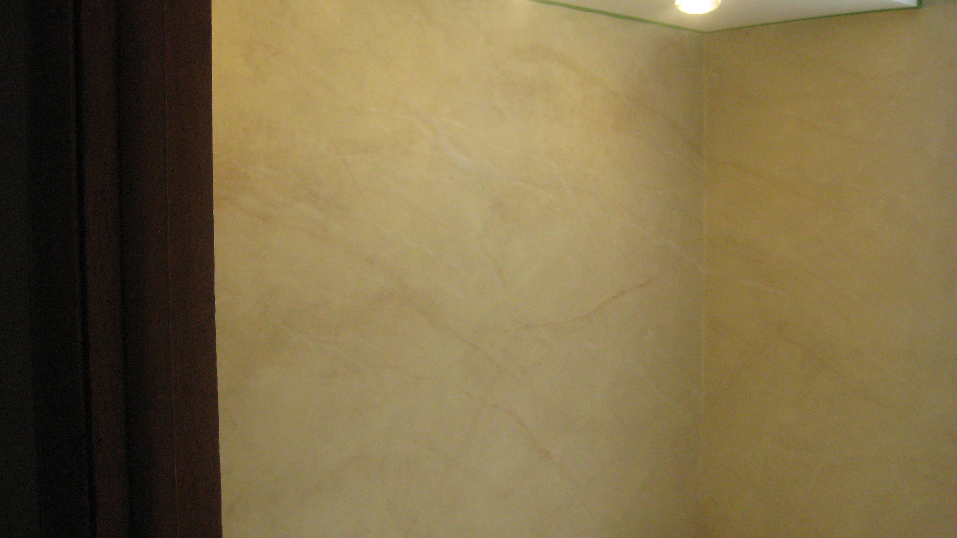
Upper Foyer Landing, first layer BM af-305 Ylang Ylang

Supplies needed for this finish are:

Base Coat: Ben Moore Ylang Ylang AF-305

Ben Moore Metropolitan AF-690

Ben Moore Cotswald AF-150

Premixed Joint Compound

Modern Masters Metallic Paint: Silver (add an 10% Extender)

Lamp Black Acrylic

Faux Effects Aquacreme/Mastercreme

Faux Creme Colors Van Dyke Brown and Dark Brown

Tools: Japanese Trowel, Stencil brushes (large), chip brush and spray bottle

  1. Create 2 separate mixes of 1 to 1 ratio of paint and premixed joint compound using Ben Moore Aura Cotswald AF-150 and Metropolitian AF-690.
  2. Trowel Paint colors Randomly, with a vertical pattern, don’t overload your trowel with mixture.

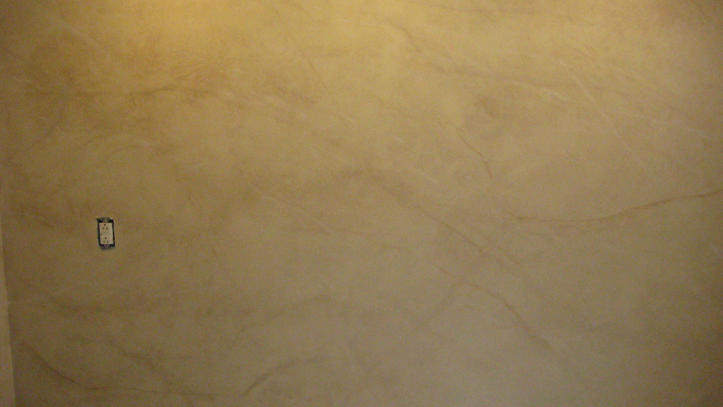
Step 3: Joint compound mixed with Aura Cotswald AF150 and Metropolitan AF690 Second Layer

3.   Trowel second layer, using both colors again and working wet on wet. Use a spray bottle of water to spray surface, then apply causing mixture to drip lightly. Let dry.

4.  Stencil Grand Damask Motif randomly over the surface first with Modern Masters Silver.

Production Stencil, 2nd floor foyer, modern masters Silver metallic

5. Stencil additional Grand Damask motifs with Lamp Black, adding silver again over black here and there.

Adding Lamp Black with touch of silver, over Stairway, Whew!!

6. Thin the Metropolitan Joint Compound mixture 1 to 1 with water, using a chip brush apply this in  vertical drips from the top of the wall. Do this by loading the brush well and pressing it hard onto the surface to release the paint mixture. Allow to dry.

7. Mix Aquacreme glaze at a rate of 1 cup Aquacreme to 2 teaspoons each Vandyke and dark brown creme colors. Thin this with 1 to 1 water and apply in drips from top of wall to bottom with a large chip brush. Allow to dry slightly and spray with water, using the chip brush and additional glaze on spray water here and there to keep glaze open and make it drip more.

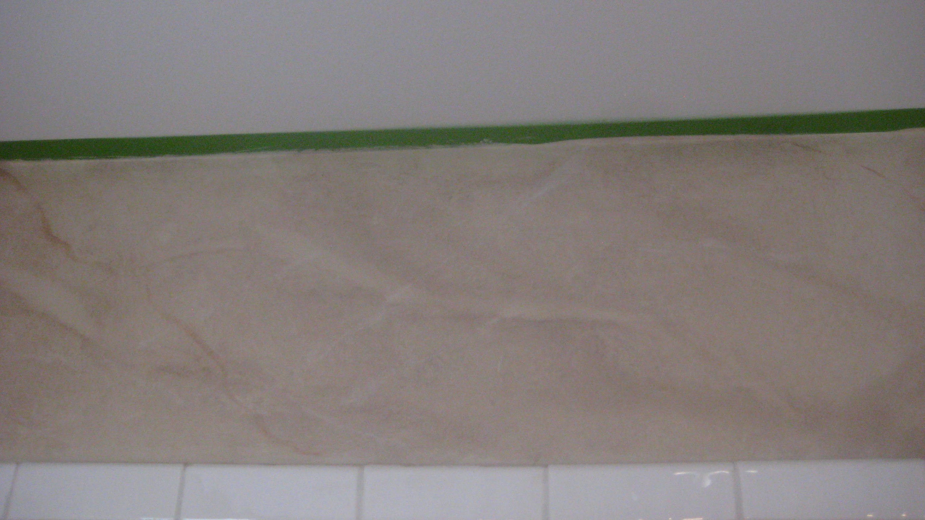
The glaze and van dyke brown mixed with dark brown push the stencil back and create a great strie on the walls giving an aged look to the walls.

The finished Foyer was Spectacular!! It had an aged appearance with a modern feel. Loved the look, and transformation! Just another adventure in Styleland, hope you enjoyed this one!

Stay tuned as always,

XOXO

M

Read Full Post »

Expressing yourself with things you love is what makes your home your retreat. An escape to a place that brings happiness, where you come to gather with family. As summer comes to a close, we begin our retreat indoors. Taking a new look at our home, we start to think of things to edit aesthetically. Simplicity is what we are moving towards, time to declutter! We are looking for the serenity that means “home”.  In spring, we do “spring cleaning” after our winter solstice, we do” fall cleaning” and when we return indoors after our summer soiree we do exactly the same, we look at life’s transitions that often warrant taking stock, so we begin to edit getting rid of excess baggage. What we end up with are our favorite things.

Autumn to winter, winter to spring,

Spring into Summer, summer into fall…

So rolls the changing year, and so we change:

Motion so swift, we know not that we move.

by Dinah Mullock Craik

Since ancient times, September is viewed as the beginning of a new year, a time for reflection and resolution. I love antiques, but this year I feel the need for change in my own abode!!! I would like to become more transitional than traditional. Feeling the need to lighten the load! A palette of neutrals and cool pastels… linens, canvas, sisal is my soothing antidote. I will keep my antiques, I love the chips, cracks and crumbles of the pieces I’ve collected, but I will declutter and lighten the pallet in my home, adding some transitional pieces that will make a change.  I’ll leave with some inspiration that has helped me move towards creating my retreat and transforming my home…

As always stay tuned…

XOXO

M

Read Full Post »

Bedroom Verona

Dressing up windows has never been easier. Anything goes. Home centers have a multitude of rods and poles designed to achieve a custom look for any style window!

Windows come in all sizes, and there’s a drapery or shade for every situation. Long draperies generally create a formal effect, while short curtains or shades look more casual. Curtains can create an illusion, altering the look of the window dimensions.

Before

To create an illusion there are a couple of things we can do, widen the window and make the window taller. With this layered treatment we did just that! Creating a sleek and sophisticated layered treatment!

Romans and Panels hung close to the ceiling and at the sides

of the window.

The features and functions of window treatments are many! The create a sense of style, visual interest, softness and warmth. They also are used for light control, privacy, exterior noise control and interior noise reduction. As I mentioned above, illusion create balance between windows or add height to low windows. Another use for window treatments is to camouflage to hide architectural flaws, or oscure a bad view.

I love layered treatments such as custom Flag valance panels,

Flag Valance Panels

I love the options you have, whether it be romans or roller shades, cornices or pelmets layering is in!!

Jackie Von Toble has a blog that I love, she has written one of the best design directories for window treatments, here is a link to her blog Jackie Blue Home. Window Treatments are a great addition to your home, my facination with fabric and design has just begun, so…

As always stay tuned for more adventures in styleland!!!

XOXO

M

Read Full Post »

Read Full Post »

From the moment a designer first starts sketching a new space, she will give thought to the materials you would like to use, and make sure the design is the right fit for you and your home. But what designers really create is pure art and beauty to inspire your home!  Recently, I decided to do some research and found some great pictures of Kitchens and Baths that take design to a new level, of course there are a few of my favorites thrown in as well hope you enjoy these:

Goforth Gill Architects

Shaker style began a rise in popularity in 2009 and gained momentum in 2010. By the end of the year, Shaker has supplanted Contemporary as the second most popular style used by  designers, while Traditional remains the most popular style. Cottage was the only other style to garner at least 20% of the market. 
Dark natural finishes overtook medium natural, glazed, and white-painted finishes to become the most specified type of finish toward the end of 2010.

Chris Novak Berry Brooksberry and Associates

While medium natural cabinet finishes fell from being used, dark natural finishes rose from 42 to 51%. Light natural and colored painted finishes remained fairly common and distressed finishes dropped significantly.

Cabinetry options also changed recently,  Wine with everything. 
While the incorporation of wine refrigerators seems to be on the decline (below), unchilled wine storage is growing in popularity. Other types of cabinetry options are on the decline, including tall pantries, lazy Susans , and pull-out racks. Appliance garages also seem to be falling out of favor, as their use declined from the end of 2009 to 2012.

Four doors, 
the French door refrigerator has strengthened its position as the type specified most often by designers. While freezer-top refrigerators were always used by designers, as 2010 drew to a close, freezer-bottom models began to gain popularity.  Side by side refrigerators have made a good showing, still being used in many designs.

This Kitchen was created by my friend and colleague Denise Maurer of Denise Maurer Interiors, It was featured in  June 2012 Country Living Magazine! Love the Soap Stone carved sink with whale motif!  The owners are Bonnie and Bill Daggett’s this is their Massachusetts beach house. This is just a little excerpt from the article:

 
 “My theme was ‘sun, sea, and sand,’ and I love painted furniture,” Bonnie says.  She envisioned lobster-red Adirondack chairs, gray-blue night stands, and a  melon-bright coffee table, but choosing the right shades proved difficult. The  yellow she originally picked for the kitchen morphed into something “too ugly to  describe,” says her friend and interior designer Denise Maurer, who recommended  white wall tiles and Celadon cabinets instead. “The natural light in Chatham is  different than in most places,” Bonnie explains, since the water shifts from  gray to cerulean throughout the day. “Artists come here because of the way color  is reflected and perceived.”Read more: Green Kitchen Cabinet – Colorful Beach House Decorating Ideas – Country Living .
Now for some of Clive Christian’s gorgeous kitchens, sumptuous baths from Candice Olsen and a few other favorites:
 
Ending with this spectacular Kitchen, as Shakespeare has said “Parting is such sweet sorrow”…………
Stay tuned for more adventures in Styleland!
XOXO
M

Read Full Post »

I always read CertaPro’s Facebook page, they had a link to this post by Mckenzie Brickl from STIR Magazine, I talked with Mckenzie several years ago when I worked with Sherwin Williams about color and blogging. I thought I would repost this.. a little incite into why we paint our porch ceilings blue so often. Enjoy….

Once just an old Southern tradition, the blue porch ceiling has made its way north and is being introduced to new generations. There are numerous theories as to why — from fooling spiders and wasps into thinking the ceiling is the sky, to blue being a harbinger of good luck, to the color extending daylight, to scaring away evil spirits.

In the Northwest, aurora blue is a popular shade for the porch ceiling. It’s associated with the Aurora Colony, a Christian communal society that gained popularity in the 1850s.

Blue porch ceilings are also quite prevalent along the east coast, from Boston to Philadelphia and other historic cities, where Victorian and Colonial homes abound.

Sky blue ceilings were a popular color scheme for the Victorians, who preferred the colors of nature when painting their homes. Mustard yellow, ochres, browns, olives, terra cotta and the color blue were commonly used in exterior paint schemes. The warm earth tones reminded the Victorians of the outdoors around them, with the blue reserved for the porch ceiling to remind them of the blue sky even when the days were overcast and gray.

The Significance of Haints

Blue ceilings are popular and have been popular in the South for centuries. “Porch ceilings have always been blue in the South,” says  Lori Sawaya, an independent Principal Color Strategist. “People continue to paint their porch ceiling blue because that’s what their grandmother did, and that’s what her grandmother did.”

But many Southerners suggest that blue porch ceilings originated out of the fear of haints. Southerners, especially in the area of South Carolina, have a name for the ceiling paint used on porches — the soft blue-green is referred to as “Haint Blue.”

“Haints are restless spirits of the dead who, for whatever reason, have not moved on from their physical world,” says Sawaya.

Haint blue, which can also be found on door and window frames as well as porch ceilings, is intended to protect the homeowner from being “taken” or influenced by haints. It is said to protect the house and the occupants of the house from evil.

Blue Paint as Insect Repellent?

Some people swear that blue paint repels insects, leaving a porch bug-free and pleasant during those long summer evenings and afternoons. Most credible sources discredit this belief. However, this belief could be seated in historical truths.

When blue paints were first used on ceilings, they were usually milk paints, and those paints often had lye mixed into the composition. Lye is a known insect repellent, which would explain why insects would avoid nesting on a painted porch ceiling or ledge. As milk paint has a tendency to fade over time, giving it a rustic look, people would usually need to repaint their home every year or few years, covering the existing coat with a new coat of paint, and fresh lye.

But many still theorize that insects prefer not to nest on blue ceilings because they are “fooled” into thinking the blue paint is actually the sky.

Extending Daylight Hours

Haints and insects aside, many people choose to paint the porch ceiling blue simply because of the way it makes the room look and feel. Blue is a calming color, so using it to paint an area of the house that’s intended for relaxation makes sense. Throughout the U.S., porches are often a favorite place while the weather is warm, or even hot, to sit and watch time and life go by. When sitting on the porch, it can seem as though life has taken on a slower pace, as though relaxation is a must.

People may also paint the porch ceiling blue because the color seems to emulate the natural sky and makes the daylight hours feel as though they last just a little longer. “Light blues especially lighten and brighten space and propagate any light that you do get, because of the basic nature of color,” says Sawaya.

Picking the Right Blue

Most paint experts agree that the best shade of blue is the one that fits the look of the house. “You don’t want [a blue ceiling] to look like an afterthought or like it came out of nowhere,” cautions Zoe Kyriacos, architectural color consultant for Colors by Zoe in Takoma Park, Md. “You want to make it look like it was part of the package.”

She says blue can be used on any style of house; it just depends on the blue. “A traditional house would use a more traditional color, something lighter. On a contemporary house you can do something bolder, something brighter.” Kyriacos prefers blues with hints of other colors, which make the blue more complex and interesting, she says. A blue with a drop of red in it, for instance, adds “a little warmth.”

Hope you have enjoyed this post, I know I did. In Feng Shui blue is a water color represents the healing waters and the clear sky, it belongs to the water Element. I have long recommended blue doors for a home, so whomever enters will have a calm feeling. Blue should be used in the feng shui bagua areas in the East ( health & family) and Southwest (wealth & abundance) of your home, as water energy nourishes the wood element of these feng shui areas.  That’s just my input on the color blue…. What’s yours???????????

As always, stay tuned…..

XOXO

M

Read Full Post »

One of my favorite designers, Miles Redd was raised in Atlanta, moved to NYC to study film, but was more interested in design. He worked with another of my favorites Bunny Williams,  this month he is featured in Veranda Magazine, This house in Hudson NY, near to Albany NY where I’m located.  I would love to see this home!!! Veranda looks at the Master bath, this is the dining area, in the home.

also featured in 2010 Veranda, he favors chinoiserie wallpaper and the color turquoise! Here is the House of Turquoise!


Winner House of Turquoise!!!


Redd is currently the creative director of Oscar de la Renta Home and continues to wow the design world with his luxurious, one of a kind interiors!

below, his mirrored master bath ~ photos by Jeffrey Hirsch for New York Social Diary
Here are a few photos from the home in Hudson NY,  you will see why he is one of my favorites…
Courtesy of Elle Decor!!
This man is a color genius!! This home opulence at its finest.  Just inspire me!!!!!  Loving this profession, nothing like these talented people to help give you vision and clarity about how to create beauty. One more for the road, de Gourney custom wallpaper, fabulous………..
As always stay tuned……….
XOXO
M

Read Full Post »

My desire for beautiful things led me to the wonderful world of custom window treatments. These windows could not be created through JC Penny’s (not to diminish the great treatments they sell but…) finding all the beautiful window treatments we see in magazines, made me think… you must know that designers create them, right??. Our vision along with the talented women and men who run our workrooms. They can take the idea that we draw on a piece of paper along with the fabric that we send to them and make our thoughts a reality. There is nothing as beautiful as a custom window treatment!  I hope you enjoy my long love-affair with fabrics, fringe, draperies, tassels and all things to do with improving your view………. There are just so many talented people out there designing, creating, sewing, building, and making the world a more beautiful place… Just to share some of the fabulous Window Treatments I have come across lately. As you all know I love Roman Shades but the elegance of these draperies makes me long for more formal spaces…

Smocked Header so feminine and lovely…..

Barry Dixon Decorator magazine

Sue Ellen Gregory Design

I just love this room by designer Sue Ellen Gregory, love the bench! tea anyone? Here’s a rod-pocket done well, and I love the way they’re mounted on the hold backs… Wow that’s just talent!!!

Judy King

Love this whole room!!!! What beautiful windows!!

Swept back silk with those cute little london’s in the bay (this is opera’s Renee’ Flemings’ home) window by Jamie Gibbs Assoc.

OMG!!!!! These are the one of the most creative!!!! Inverted pleat with bows!!!!!!!!!!! They just make you smile :-) Susan Schurz.

                        With Rods and Rings taking Center stage this box pleat heading is so popular right now!!

Jan Cote

This is luxury, love the leading edge on the panels!  Great Bench!!!!

Christina Azario, so I’ll end here with the luxurious Panels and of course ROMAN SHADES!!!! My favorite…. Hope you’ve had a good time I know I did..

As Always, stay tuned…..

XOXO

M

Read Full Post »

Thank you to Tania for letting me create a Marble Spa in your Bathroom, Just a quick post!!!  More pic’s to come of some on going work I am doing!!!! Life is good, Girls are great, Mother Theresa Coming to oversee Father’s Day Feast tomorrow!!!

ImageImageImageImage

As always stay tuned!!!

XOXO

M

Read Full Post »

Good Morning and let’s welcome another week of frolicking and  summer fun. I can’t believe its June already!!! Summer is here and life is in full swing!! Some great design ideas for Summer entertaining! We’ll start with Bellini’s my favorite! I love serving cocktails on the deck on a great summer day!

Kiwi-Strawberry Bellini Makes: 8 servings

4  Kiwi

16 Strawberries

1 (750ml) bottle Prosecco
Remove skin from kiwi fruits, cut into quarters.  In a food processor or blender, puree until smooth. Remove  stems from strawberries, cut in halves.  In a food processor or blender, puree until smooth. Spoon kiwi puree and strawberry puree onto the bottom of champagne glasses, about 1 to 2 heaping tablespoons each.  Pour over fruit puree and enjoy.
*Note: you can substitute Prosecco with sparkling white grape juice for a non-alcohol version.

Summer is here at last and so is lingering in summer spaces. The photography that Horst shot for Vogue and House & Garden in the 1960s, 70s and 80s has such enduring appeal. Right now, I’m drawn to spaces with summer-style. I hope you are finding time to linger in summer spaces, too.

Here is a view of  Schoon Lake in New York. On this beautiful site Eagle Capital Group is building a Spa and Resort,  to be named”StoneLedge”.  Myself and Maurer Interiors will be helping with the interior design of this project. We were so excited to share this vision with him. What a slice of heaven!!

Just a few outdoor spaces to end today!!

As always stay tuned….

XOXO

M

Read Full Post »

« Newer Posts - Older Posts »

Jenny Komenda

Design, Fashion and Food!

Just Imagine ExtraOrdinary

Reimagining the ordinary in homes, gardens and our lives.

Your Modern Couple

the design blog you never knew you needed

A Little Bit of Boondock Life

Just another day in the middle of nowhere...

Frugal with a Flourish

Design, Fashion and Food!

Clover Lane

Design, Fashion and Food!

somethingville.com

where my ideas come to life