Feeds:
Posts
Comments

Posts Tagged ‘Paint Colors’


In honour of mothers on their special day, I asked myself what decorating secrets did I learn from my Mom…

mom carol and I

She made our home beautiful, chic and inspiring while juggling both a full-time job and being a mother. I learned about fabrics and sewing from my mom. She was an extraordinary seamstress. When I was little, I loved going to the fabric store with her — it was a world of imagination and creativity. She taught me to appreciate quality, natural fibers like wools, silks and fine cotton. Now working with fabrics is one of my favorite parts of decorating.

Another important lesson she taught me,  never to buy what I don’t need: a bargain is only a bargain if it’s something important. I also learned all about color selection and furniture arranging from her. We lived in Brooklyn NY in a 6 room apartment, she always kept it fresh, ever changing.. and I firmly believe that had this wonderful woman been any less interested in our family home as I grew up, I might not be where I am today.

My mother taught me that it’s important to develop personal style,  buy the best quality you can afford and mix family pieces, antiques and comfortable upholstered furniture– eat in the dining room, use your china or better dishes on Sundays.. I learned to respect our home and everything within it, including my mother.

My mom used to rearrange the furniture a lot — it’s surprising how furnishings can look completely new when viewed from a different angle or in a different room. She also taught me that every window looks empty and cold unless softened by a window treatment, she changed hers often.

She was never afraid of bold patterns, I remember her sewing room or the SPARE ROOM, we had large orange and yellow wall paper, and smaller floral wall paper on the ceiling.. It was cutting edge at the time..

When I was little, my mother always dressed — she was glammed up even when cleaning the house. From her, I learned to dress and decorate with the intent to be gorgeous, having no fear of color.

I will end here with a couple of ideas for what to do for your mom..

Source and pay for a house cleaning service for a few months. A house cleaning every two weeks, I’m sure all moms would appreciate the break. That being said, do not buy her a vacuum, cleaning supplies, or tools unless she specifically asks for them. I’m looking at you Dad.

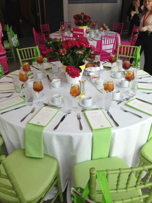
Brunch was always a favorite of mine.. I loved to go to a special Italian place locally that served cured meats..fresh fruits..baked delights and my family would all laugh and enjoy the meal together…

table scape

Spend time, yes…time… take the day and pull out pictures, family vacations reminisce with her, make cookies sit and have a cup of coffee.. Love her and let her know that she is the most important women in your life.

Mom and Dad


Miss you Mother Theresa…All my love


XOXO


M


Read Full Post »

I always read CertaPro’s Facebook page, they had a link to this post by Mckenzie Brickl from STIR Magazine, I talked with Mckenzie several years ago when I worked with Sherwin Williams about color and blogging. I thought I would repost this.. a little incite into why we paint our porch ceilings blue so often. Enjoy….

Once just an old Southern tradition, the blue porch ceiling has made its way north and is being introduced to new generations. There are numerous theories as to why — from fooling spiders and wasps into thinking the ceiling is the sky, to blue being a harbinger of good luck, to the color extending daylight, to scaring away evil spirits.

In the Northwest, aurora blue is a popular shade for the porch ceiling. It’s associated with the Aurora Colony, a Christian communal society that gained popularity in the 1850s.

Blue porch ceilings are also quite prevalent along the east coast, from Boston to Philadelphia and other historic cities, where Victorian and Colonial homes abound.

Sky blue ceilings were a popular color scheme for the Victorians, who preferred the colors of nature when painting their homes. Mustard yellow, ochres, browns, olives, terra cotta and the color blue were commonly used in exterior paint schemes. The warm earth tones reminded the Victorians of the outdoors around them, with the blue reserved for the porch ceiling to remind them of the blue sky even when the days were overcast and gray.

The Significance of Haints

Blue ceilings are popular and have been popular in the South for centuries. “Porch ceilings have always been blue in the South,” says  Lori Sawaya, an independent Principal Color Strategist. “People continue to paint their porch ceiling blue because that’s what their grandmother did, and that’s what her grandmother did.”

But many Southerners suggest that blue porch ceilings originated out of the fear of haints. Southerners, especially in the area of South Carolina, have a name for the ceiling paint used on porches — the soft blue-green is referred to as “Haint Blue.”

“Haints are restless spirits of the dead who, for whatever reason, have not moved on from their physical world,” says Sawaya.

Haint blue, which can also be found on door and window frames as well as porch ceilings, is intended to protect the homeowner from being “taken” or influenced by haints. It is said to protect the house and the occupants of the house from evil.

Blue Paint as Insect Repellent?

Some people swear that blue paint repels insects, leaving a porch bug-free and pleasant during those long summer evenings and afternoons. Most credible sources discredit this belief. However, this belief could be seated in historical truths.

When blue paints were first used on ceilings, they were usually milk paints, and those paints often had lye mixed into the composition. Lye is a known insect repellent, which would explain why insects would avoid nesting on a painted porch ceiling or ledge. As milk paint has a tendency to fade over time, giving it a rustic look, people would usually need to repaint their home every year or few years, covering the existing coat with a new coat of paint, and fresh lye.

But many still theorize that insects prefer not to nest on blue ceilings because they are “fooled” into thinking the blue paint is actually the sky.

Extending Daylight Hours

Haints and insects aside, many people choose to paint the porch ceiling blue simply because of the way it makes the room look and feel. Blue is a calming color, so using it to paint an area of the house that’s intended for relaxation makes sense. Throughout the U.S., porches are often a favorite place while the weather is warm, or even hot, to sit and watch time and life go by. When sitting on the porch, it can seem as though life has taken on a slower pace, as though relaxation is a must.

People may also paint the porch ceiling blue because the color seems to emulate the natural sky and makes the daylight hours feel as though they last just a little longer. “Light blues especially lighten and brighten space and propagate any light that you do get, because of the basic nature of color,” says Sawaya.

Picking the Right Blue

Most paint experts agree that the best shade of blue is the one that fits the look of the house. “You don’t want [a blue ceiling] to look like an afterthought or like it came out of nowhere,” cautions Zoe Kyriacos, architectural color consultant for Colors by Zoe in Takoma Park, Md. “You want to make it look like it was part of the package.”

She says blue can be used on any style of house; it just depends on the blue. “A traditional house would use a more traditional color, something lighter. On a contemporary house you can do something bolder, something brighter.” Kyriacos prefers blues with hints of other colors, which make the blue more complex and interesting, she says. A blue with a drop of red in it, for instance, adds “a little warmth.”

Hope you have enjoyed this post, I know I did. In Feng Shui blue is a water color represents the healing waters and the clear sky, it belongs to the water Element. I have long recommended blue doors for a home, so whomever enters will have a calm feeling. Blue should be used in the feng shui bagua areas in the East ( health & family) and Southwest (wealth & abundance) of your home, as water energy nourishes the wood element of these feng shui areas.  That’s just my input on the color blue…. What’s yours???????????

As always, stay tuned…..

XOXO

M

Read Full Post »

So I’m officially a Certapro blog Junkie, and my friend Ed Mattingly has joined the team as their faux expert. I met Ed a few years back when I did some work for Sherwin Williams. He’s such a great guy and extremely knowledgeable when it comes to decorative finishes and Sherwin Williams Faux products. I enjoyed attending a workshop Ed hosted, he was introducing the new Faux  line of Products from Sherwin Williams. We really had fun working with some of the newer products especially the smooth metallic and venitian plaster!! So easy to apply and great results!

This post was  written  for me, I  love to relate colors to food (who would guess this little italian girl would do that!).  This take on color from our Certapro blog inspired me, so here we go… which is your favorite group?? I’m loving the Berry Rich!

XOXO

M

Read Full Post »

I’ll start with a Thank You to Nathaniel Bette,  he is a remarkable man, his vision, perseverance, unending patience and good nature made this year’s showhouse such a great project to be involved in. When I first saw the home back in October, I was inspired to do a period design. Here are some of my early pictures of the room, when I first learned I was going to do the Guest Bedroom!  I loved the fireplace, recently one of the many people whose talents stand out in the restoration of this home,  is a gentleman called  CJ (who worked for Nate, over seeing many projects and also did the italian venetian plaster ceiling in the wine cellar), he mentioned that the marble used for the mantle on the fireplace was rare and is no longer available, it’s characteristics  are similar to Grigio Carnico in color and veining,  this is fireplace is stunning. The view from the Guest Room windows are of the Helderburg Mountains. The artwork above the mantel mimics the hills and valley’s preceding the mountains , which is what you see from the endowment, out the south window of the room.

The walls were painted by Jason D’Amrbosi for me, he was again one of the many artisans that took part in this transformation. The color on the walls is Lunch Bag, from the  Martha Stewart palate. Benjamin Moore donated the paint for this space, Thank you to Miller Paints in  Latham, NY!!  The finish we chose for the walls from Faux Effects, it is a troweled finish called Luster Stone. 


Working with Mary Beth was terrific. We adjusted the gradation of color in the Luster Stone with the tint formula (provided by Ben Moore) and the walls were transformed into suede, the subtle depth that I conjured up in my head was there… perfection. It was as if the layers of plaster took on a pearlized finish, the soft shade was so alluring. We did this finish in two days, the first day we taped off the ceiling and moldings. The tools we used were a textured roller and trowel. Once we applied the luster stone onto the wall we used a trowel to tight trowel off the product and create a smooth textured look. It was all coming together, loved the Gray Cashmere on the ceiling it was the perfect back drop for the ceiling medallion… we were ready for  draperies and furnishings!!

Finding a Bed for this room was a passion,  I was looking for a focal point in the design, this piece of history from the Civil War, belonged in this house and was perfect for the Guest Room! The story behind this bed was quite interesting. Circa 1861, this hand painted bedroom set includes: Bureau that has a mirror, night table and two chairs. This set was made in Sudbury Massachusetts by a resident (Smith) who was leaving to fight in the civil war. He left the set for his daughter to paint while he was gone, which she completed flawlessly. The floral painting on the head board was fabulous!!! All the pieces to this set have similar hand painted floral arrangements on them, there are roses, lilly of the valley and pansies. Simply exquisite! The families related to this story are Smith (Seneca Smith Chief of Police, Sudbury MA) and Curt Garfield the Sudbury Town Historian. I purchased this from Johanna Withiech in Tenafly NJ. Johanna and Michael brought this up to Albany for showhouse, the bed room set is for sale, I have all the pieces in my possesion, although I only used the headboard in the Guest Room. The bureau was worn and the mirror was missing, we didn’t have enough time to have them restored.  She was happy to have this bed in such a historic Showhouse, and the moment it came off the trailer I knew it was the perfect complement to this room. Johanna would like to see this bed room set in a historic home and I would also, please contact me if you know of a  historic home that this set could be part of. Thank you to Johanna for her expansive knowledge of the history of this bed and for journey to deliver it.

A couple more pictures for you….

I started with thank you and so it seems that it would be appropriate that I would end with the many thank you’s  to the  people who helped and participated in my space, to the wonderful, Barbara Richer who is always there to answer any question, help with a resource, talk with you and help with any concerns you may have. Barbara was, ever-present , always kind, loyal, caring, sympathetic, reassuring, compassionate, understanding, encouraging, empathetic. Her guidance is so appreciated, her strength is inspiring. To Grace Thomas, who is my friend and supported me through out this project, Mary Beth Johnson, for her enthusiasm and energy, Nancy from Saratoga Signature, for lending me everything I could have needed and more, Debbie from Stockade Imports for her unending support, she was such a tremendous help in pulling everything together, she not only supplied the rugs in this space but many of her own accessories to finish this room! Anna Privitera whose Marshalls trip was so successful, also her help with researching antique beds for this room! Rae Rau for cutting in my medallion when my hands were unsteady. To my wonderful husband for all  his support and help with art work and extending his Honey do list, to my room!! ” You are the wind beneath my wings, you might have appeared to go unnoticed, but I’ve got it all here in my heart. I want you to know I know the truth, of course I know it. I would be nothing without you!”  I love you… your unwavering support and encouragement that means the world to me!

Signing off for now, as always stay tuned…………….

XOXO

M

Read Full Post »

Jenny Komenda

Design, Fashion and Food!

Just Imagine ExtraOrdinary

Reimagining the ordinary in homes, gardens and our lives.

Your Modern Couple

the design blog you never knew you needed

A Little Bit of Boondock Life

Just another day in the middle of nowhere...

Frugal with a Flourish

Design, Fashion and Food!

Clover Lane

Design, Fashion and Food!

somethingville.com

where my ideas come to life