Feeds:
Posts
Comments

Posts Tagged ‘home decor’

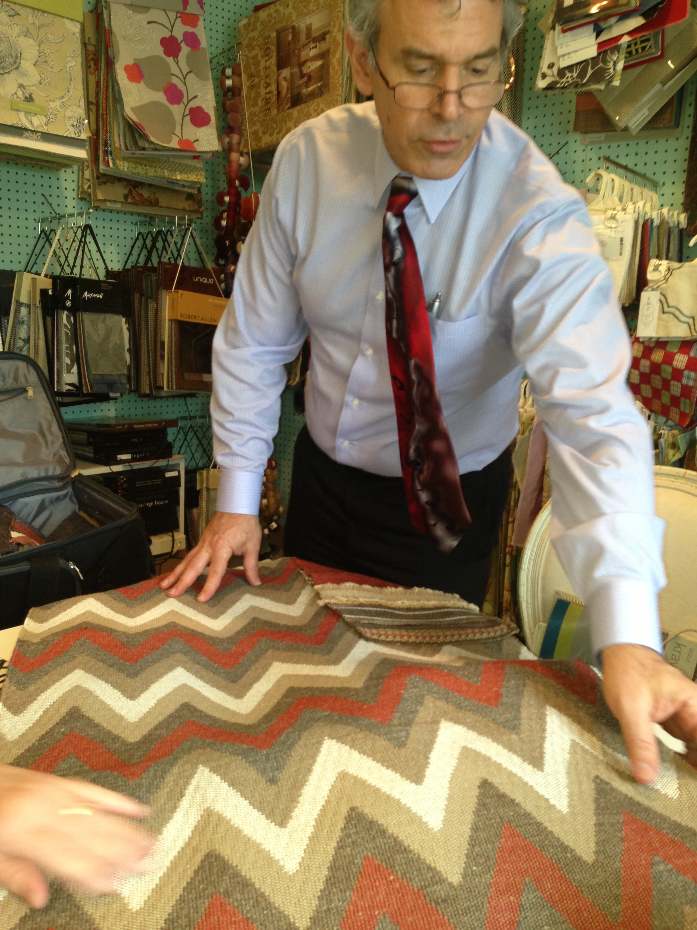
This recently completed master bath renovation was in a newly built home. The owners were happy with the layout of the bathroom but, wanted to punch it up a bit! The master bathroom should be your sanctuary, as stylish as it is soothing. We wanted to turn the existing bath into something unique.

I’ve rounded up a stunning way to create the dream bath that they would love being in. This bathroom was to be transformed into a peaceful escape reserved for the masters of the house.  With stunning tile work, soft fabrics and a calming color palette blend to form a decadent space designed for relaxation.

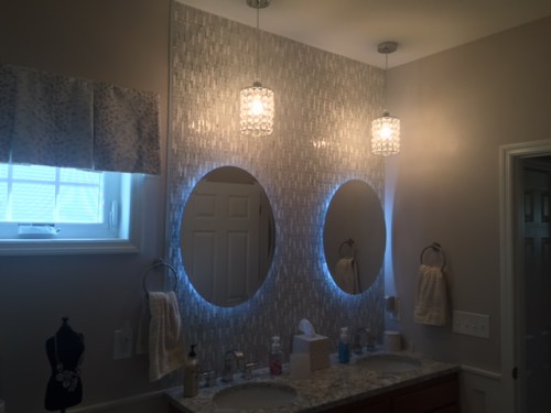
I started wall a gorgeous tile, the moment I saw this glass tile I knew.. this was perfect. And I was right, the owners squealed with excitement when I presented my ideas and finishes.

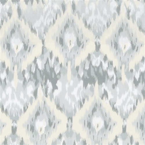
We chose a white glass tile, Jeweled j-603 in diamond white: The combination of finishes on the sheet of tile are clear glass,  wavy glass, frosted glass and marble,  it is exquisite.Jewel tile

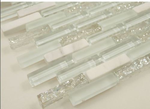
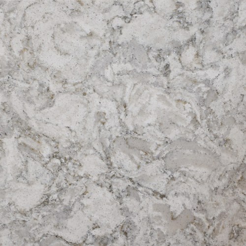
The countertop, I used is  Cambria: Berwyn, this silver flecked stone adds a soft yet glamorous touch to this master bath.

Cambria-Berwyn

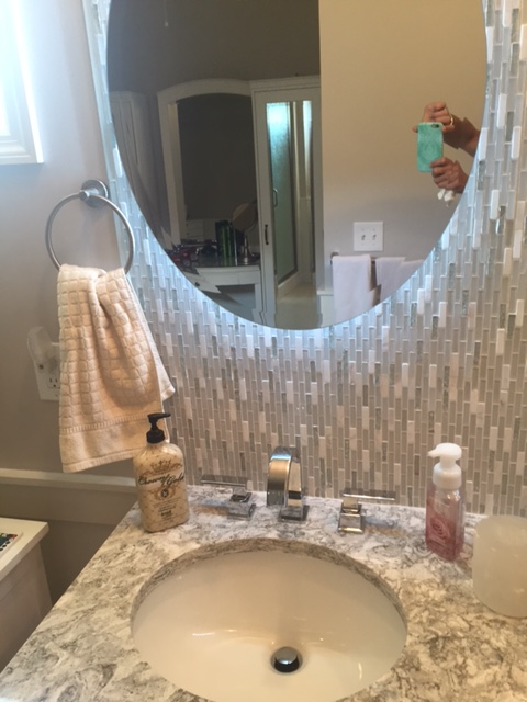
The Delta Vero Lavatory Faucets with waterfall spout, gives the right touch of sophistication to this charming master bath without breaking the budget.

IMG_6884

I took the bathroom mirror and lighting under the microscope to show how this bath accessory can change the ambience of your bathroom. Remember the main task of lighting in the bath, both direct and indirect is to caress and compliment you.

What do you think about illuminated mirrors? I used the LED Strip lights to back light the mirrors in this design, providing illumination as well as visual style above the vanity’s white under-mount sinks and quartz countertops.

IMG_6886

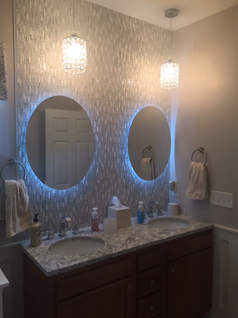
Two glass jeweled pendants hang above the double vanity adding a bit more interest and an elegant look.  Its tailored, not to girly for a man, and has a upscale feel in a restrained way.

IMG_6883

The lighted mirrors are remote controlled to fade to different colors and also soften or brighten with a touch.  The darker wood cabinets provide a subtle contrast with the lighter tiled floor.

IMG_6880

“It is a very luxurious spa like experience in this bathroom” the homeowners said when the project was completed.

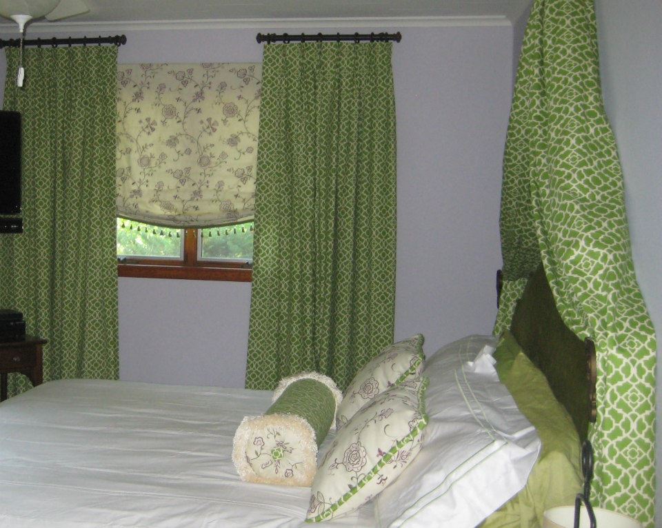
It’s the details that give this Master suite a luxurious touch. I was hoping to create the sense of a 5 star hotel, it’s very important I think, that is  the experience you have when you walk into this space. This space is serene and peaceful, you have the same experience in the master bedroom.


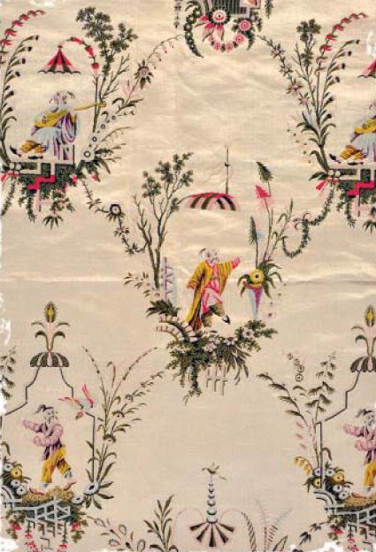
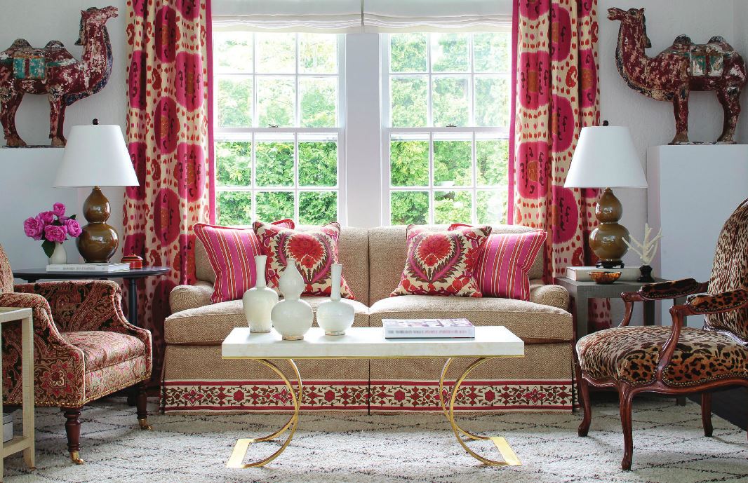
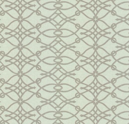
To visually connect the master suite each room plays off the colors and fabrics of the last space. Though they’re usually hidden behind closed doors, master bathrooms deserve to be as thoughtfully decorated as your home’s living spaces.


As always, stay tuned for more Adventures in Styleland!


XOXO

M

Read Full Post »


In honour of mothers on their special day, I asked myself what decorating secrets did I learn from my Mom…

mom carol and I

She made our home beautiful, chic and inspiring while juggling both a full-time job and being a mother. I learned about fabrics and sewing from my mom. She was an extraordinary seamstress. When I was little, I loved going to the fabric store with her — it was a world of imagination and creativity. She taught me to appreciate quality, natural fibers like wools, silks and fine cotton. Now working with fabrics is one of my favorite parts of decorating.

Another important lesson she taught me,  never to buy what I don’t need: a bargain is only a bargain if it’s something important. I also learned all about color selection and furniture arranging from her. We lived in Brooklyn NY in a 6 room apartment, she always kept it fresh, ever changing.. and I firmly believe that had this wonderful woman been any less interested in our family home as I grew up, I might not be where I am today.

My mother taught me that it’s important to develop personal style,  buy the best quality you can afford and mix family pieces, antiques and comfortable upholstered furniture– eat in the dining room, use your china or better dishes on Sundays.. I learned to respect our home and everything within it, including my mother.

My mom used to rearrange the furniture a lot — it’s surprising how furnishings can look completely new when viewed from a different angle or in a different room. She also taught me that every window looks empty and cold unless softened by a window treatment, she changed hers often.

She was never afraid of bold patterns, I remember her sewing room or the SPARE ROOM, we had large orange and yellow wall paper, and smaller floral wall paper on the ceiling.. It was cutting edge at the time..

When I was little, my mother always dressed — she was glammed up even when cleaning the house. From her, I learned to dress and decorate with the intent to be gorgeous, having no fear of color.

I will end here with a couple of ideas for what to do for your mom..

Source and pay for a house cleaning service for a few months. A house cleaning every two weeks, I’m sure all moms would appreciate the break. That being said, do not buy her a vacuum, cleaning supplies, or tools unless she specifically asks for them. I’m looking at you Dad.

Brunch was always a favorite of mine.. I loved to go to a special Italian place locally that served cured meats..fresh fruits..baked delights and my family would all laugh and enjoy the meal together…

table scape

Spend time, yes…time… take the day and pull out pictures, family vacations reminisce with her, make cookies sit and have a cup of coffee.. Love her and let her know that she is the most important women in your life.

Mom and Dad


Miss you Mother Theresa…All my love


XOXO


M


Read Full Post »

Revere Pewter
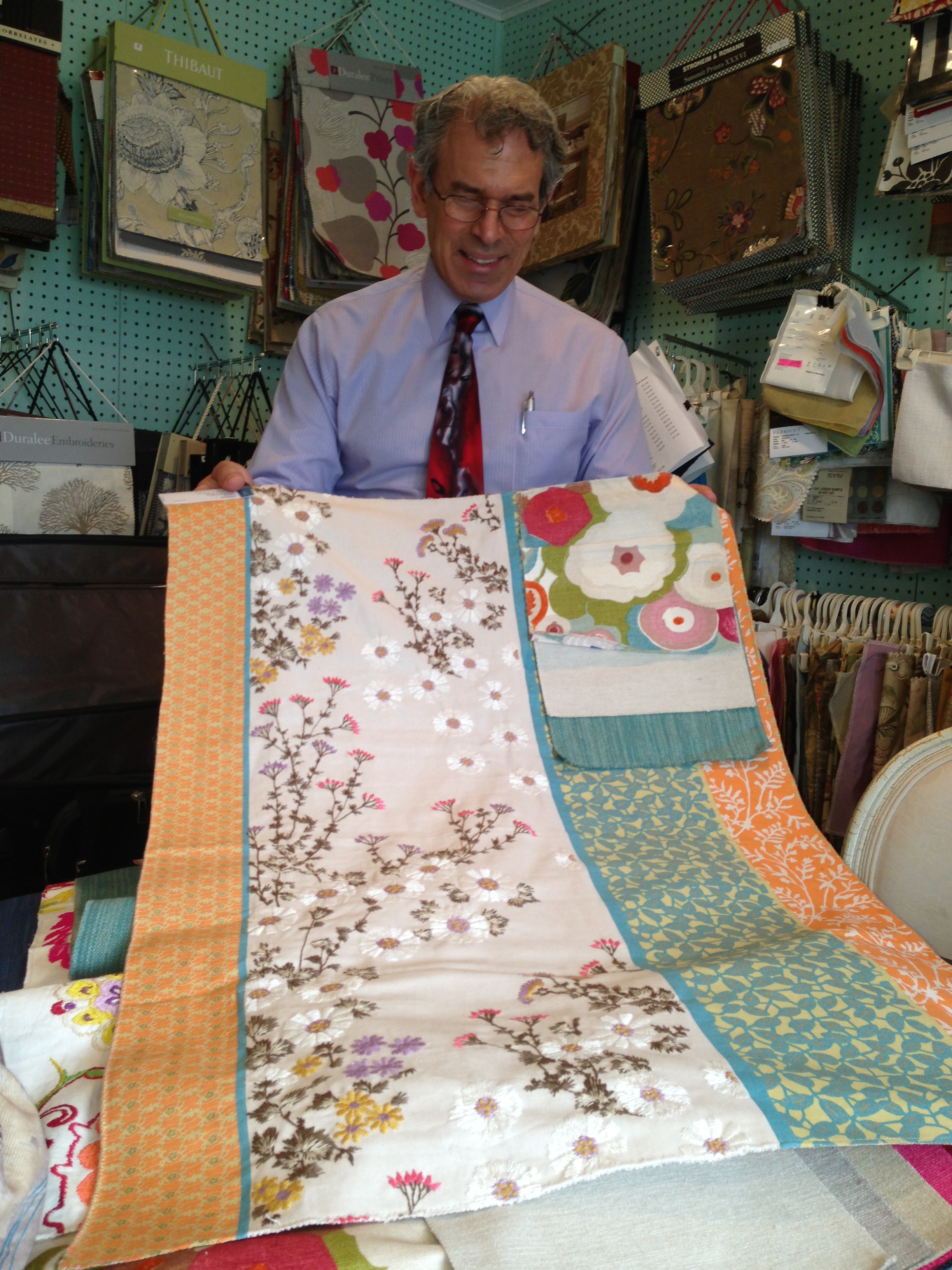
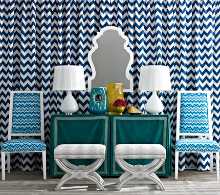
Choosing a wall color can be fun, its all in the approach….and help from your painting professional! While doing a room for Vanguard Showhouse, I was asked to do a tour through the house and talk about the paint colors. As National Color consultant for Certa Pro Painters, I was happy to lead the tour.

One of the first questions was:

Q : What is the lovely grey color on the walls? And how do I know if it’s right for my home?

Paint colors

A: The question-of-the-day on the house tour was ‘What color are the walls?’  The answer was Benjamin Moore’s Revere Pewter.  Once I answered, nearly everyone who asked the question, replied “This can’t be Revere Pewter !  I have used that color or have sampled Revere Pewter and this is not what it looked like.”  Although each person’s experience with Revere Pewter was different, the consensus was that the color looked great in this home.

Certa Pro Banan Boat

Selecting the right paint color for your space is a process that takes time and a number of steps to achieve.

There are many factors that can affect paint color:

  • Natural light : the direction the light is coming from (northern exposure and eastern exposure each provide a very different quality of light),
  • Artificial light : will you have incandescent, fluorescent, or LED lighting?  Or a mixture of some or all of these?
  • Surroundings : what furnishings, artwork, draperies, rugs, and hard finishes are there in the space?  Each of these factors will have an influence on the wall color.
I always recommend hiring a Professional Painting Service. At CertaPro Painters they know the highest quality paint products to use with the right finishes that will enhance your walls. With this expertise, they will recommend these products to you to ensure that your painted surfaces look their best and stay looking beautiful for as long as possible.
Certapro painters

Paint colors should be selected in the space they will be utilized.  Look at the color swatches next to the fabrics and finishes intended for the space.

  • Start by finding a few (2-3) options for each space.
  • Ask your decorator or Painter if he/she can order larger color sheets for you, BM has 18 x18 and Sherwin Williams has 8 x 10
  • If the large color sheets are not available, ask the paint store to mix the smallest quantity for you (in the intended sheen) for each of the options you have selected.
  • Paint the colors on a board such as poster board, or some spare drywall pieces.  Painting on the wall may seem like a great shortcut, however as soon as you put 3 big splashes of color on the wall next to each other, each of the samples is affected by the other colors, and are therefore not rendering true.  Another reason to sample on a board is that you can carry the color from room to room, as well as from wall to wall.  The color will look different on a wall with a window than a wall opposite a window than on the ceiling.
  • Seeing the color in multiple locations, and at different times of day (with natural light during the day, and artificial light in the evening) will allow you to really study the color and decide which is right for you.

If you are still feeling unsure about the process and selecting the right colors for your space, please give Certa Pro a call they would be more than happy to provide a color consultation for just the one room you are ready to paint, or your entire home or commercial space. Set up your appointment for a free quote at the Home Expo Terri Gargano of CertaPro Albany will be at Booth 348 in the Times Union Center.

Stay Tuned for more Adventures in Styleland


XOXO

M


Read Full Post »

head board bench in my garden JPG

Recently a good friend gave me a garden stone,memory stone

to remember my parents. I have an old arbor in the yard, I placed the memory stone near there, but  I wanted a place to sit… a place that would turn my garden spot into a destination, a place to linger, a respite from the daily grind, to escape and reflect…

Seating transforms your yard into a park-like oasis where you can soak in the beauty of what you’ve labored to create,  we plant vegetables every year near this area.

It also allows you to seat your family and friends in comfort while you bore them with the minute details of the six varieties of tomatoes and four kinds of peppers you’ve planted. Along with the variety of Herbs (as an Italian women,  I need my basil and parsley..for sauce of course!).

head board bench in my garden 2

The issue, as always is the expense!  Any step above plastic stackables is just scary, especially if you want something with a little more character.

head board bench swing

I saw this idea for a bed-into-bench couple years ago, and thought that is so sweet!!  The beauty of this project is its economy, its simplicity, and its endless variations, benches… swings …OMG, really your only limited by your imagination! Any Thrift Store or Salvation Army has old headboards and footboards. I happen to have an old one from a garage sale!

head board bench

You’re probably going to be painting it, so if its in rough shape it doesn’t matter!

There are so many tutorials online to help!! Fun and Fabulous!!!head board bench 5


Stay tuned… for more Adventures in Styleland…


XOXO


M

Read Full Post »

 Layering patterns involves four main elements: color, scale, shape and texture. If you’re like me and you fall in love with four times the amount of fabric you need at a showroom, you’ll need to go through some major editing. First up is color. Lay all your possible choices out on the floor and if certain ones look a hot mess and just don’t play well with others, remove them from the mix right away. It’s kinda like kicking an obnoxious reality cast member off the island after an elimination challenge but with fibers and weaves versus emotions and bad behavior.

Here’s an example of a great color edit. Notice how each of the fabrics sports different shades of a common color, blue? This is what you ultimately want; the varying intensities lead to an evolved, effortless look. Something else that’s happening here is a great mix of shapes going in different directions.

I borrowed this picture below from Ballard Designs.

Traditional

A traditional rug doesn’t have to define your space. Add in updated prints and colors pulled from the rug for a wonderful eclectic look.

1.) Carlson Rug
2.) Claire Gray
3.) Felicity Spa
4.) Lorenzo Charcoal
5.) Bark Twill
6.) Danish Linen Oatmeal
7.) Natural Microfiber, Bark Twill, Indochine Stone

8.) Kravet Indochine Ikat Stone

Traditional Layering

Contemporary

Keep a monochromatic color scheme interesting with great patterns that play well together and fabrics with tonal texture, like Kravet’s Scandicci Gray.

1.)Kravet Indochine Ikat Stone
2.) Kravet Toscana Ikat Slate
3.) Lorenzo Charcoal
4.) Asha Pewter
5.) Danish Linen Tea
6.) Scandicci Gray (Kravet)
7.) Panthea Rug (Gray)

Contemporary Layering

 Add contrast. Once you have your main color selection down, in this case its Grey, add a bit of contrast. See the Suzanni fabric #4 with the gold and pewter.

Vary the scale. While color and shape are easier to get a grasp on, scale is a bit more complicated. There are three different sizes of scale: small, medium and large. When mixing prints, try not to choose more than one of the same scale size; multiple patterns of the same scale often result in a heap of Hodgepodge. The person who does this best is Betsy Burnham, if we were all as talented as this women the world would be pattern of loveliness!

The perfect mix. We’ve got a large-scale pattern sporting an orange suzanni pattern, a medium-scale blue plaid which is traditional, and the small scale cheater global animal print. The trio is also different directionally; the rug runs horizontally, in this ethnic/global zigzag like pattern. But all of these prints work well together!! Hopefully you can use some of these tips when putting together patterns in your home…

As Always stayed tuned for more Adventures in Styleland….

XOXO

M

M

Read Full Post »

(more…)

Read Full Post »

Super Paradise Print

P Kaufmann Indoor/Outdoor Silsila Poolside (UP-073).

I absolutely love fabrics, there are so many collections from so many designers every season. In my last post I mentioned this coming week May 20th is Blogfest 2013, Kravet Fabrics is the sponsor. The patterns and colorwways in todays fabrics are truly able to transform a space with inspiring geometrics, transitional patterns, and bold colors. Here are a few of the favorites that we have been using lately. Love the headboard in this bedroom, from P. Kaufman a large print makes a bold statement in this room filled with other geometric prints and furnishings.

Beautiful Shade Schumacher

Beautiful Shade Schumacher

Since 1889, F. Schumacher & Co. has brought its commitment to superb quality and superior design to interiors where only the finest products will suffice, including the White House, the Chambers of the United States Supreme Court and countless distinguished residences. A fifth generation, family-owned company, F. Schumacher & Co. is proud to be the only supplier of decorative textiles from the 19th century still privately owned and managed by direct descendants of the founder. F. Schumacher & Co. aspires to be the top-of-mind destination for interior design professionals who value exquisite design, service, innovation, and luxury.

I have long loved Schumacher fabrics, I must say they are still the one of the leaders in the industry!

If you’re on the hunt for gorgeous fabrics to make curtains or reupholster a chair, or simply spruce up the pillows on your sofa, look at some of the Designer fabrics, and leading fabric companies, Robert Allen, Kasmir, Maxwell, Kravet, Lee Jofa, Richloom, Inman and so many others, I will leave you with a beautiful white kitchen with Silsa Poolside fabric on the stools!

P Kaufman Silsa Poolside

P Kaufman Silsa Poolside


The lovely fabrics in these rooms give a softscape to the surroundings balancing their design with color and pattern, I’m so excited to be going to Blogfest, I will share my experiences and photos with you next week! As always stay tuned for more Adventures in Sytleland!


XOXO


M

Read Full Post »

Kravet: Ted Fall

Kravet: Ted Fall

Yesterday was my day at Denise Maurer Interiors. We met with Ted Fall our Kravet consultant, he was excited to talk about some new fabrics, carpets and wall coverings from Kravet, Lee Jofa and Brunschwig & Fils. Here are some highlights from our meeting! Here is Ted  Fall holding up one of our favorite fabrics of the day!!!!

Ted Fall Kravet

Ted Fall Kravet

Brunschwig & Fils Le Jardin

Chinoiserie Le Jardin

Chinoiserie Le Jardin

Le Jardin Chinois Collection celebrates the fantasy and timelessness of chinoiserie. This as you know from past posts is a design that intrigues me! It takes me to an elegant faraway place and holds my imagination. European trade with China brought about a passion for chinoiserie, a style that captured fantasies of Chinese life ~ephemeral pagodas, long-tailed birds, men in coolie hats, flower laden vines. During the 18th century, French artist Jean Baptiste Pillement combined Chinese themes in a particular and stylish manner which proved to be very popular. Jean Baptiste Pillement  was a painter and designer, known for his exquisite and delicate landscapes, but whose importance lies primarily in the engravings done after his drawings, and their influence in spreading the Rococo style and particularly the taste for chinoiserie throughout Europe.

Brunschwig & Fils

Brunschwig & Fils

In 1941, Brunschwig & Fils founder Roger Brunschwig went off to war and his wife, Zelina, took over the family business. Mrs. B, as she was affectionately called, was a woman of great style, sophistication and inventiveness. Mrs. B is credited with developing the brand and aesthetic of Brunschwig & Fils as we know it today and for introducing scheming into its marketing efforts. Her motto “Good Design Is Forever” still holds true today.

These new collections bring a colorful approach to design with linen embroidery and crewel. Featuring bright colors, bold graphic patterns, geometric, abstract and comtemporay linear patterns that range in both vivid colors and neutrals. We were all inspired by the colorful animal prints, paisley, and Ikat fabrics that are the trend this season!

Some other fabrics Ted Fall shared with us…

Mulberry Fabric

Mulberry Fabric

Johnathan Adler

Johnathan Adler

Here are some Cheveron patterns that again have made a comeback with Johnathan Adler for kravet!

Cheveron earth tones

Cheveron earth tones

Thanks to Ted Fall for his time and sharing Kravet, Lee Jofa and Brunschwig & Fils designs in new carpets, wall coverings and fabrics. I’m looking forward to going to New York City  May 20-21, 2013 and visiting Blogfest 2013, hope to see you all there!

Blogfest 2013

Blogfest 2013

                                                                                              Blogfest 2013!!!!

Kravet is once again hosting for Interior Design Bloggers a two-day event.  Featured designers and design collaborations: Candice Olson, Thom Filicia and Sara Peterson. Also sponsors include Kravet, Lee Jofa, Brunschwig and Fils, Newel (whose showroom I’ve visited on many occasions and actually met Mr. Newel on one of my visits!) New York Spaces, HGTV Interiors, Wilsonart, Kips Bay Decorator Showhouse and ICFF.

Here is some information you’ll need:

This event is: Private

Admission Fee: $100.00
On Twitter: @blogfest2013

Please click on the widget on my sidebar for a link to the site and register!!

As always stay tuned for more adventures in Styleland!!

XOXO

M

Read Full Post »

Spring is just around the corner, and one of the best ways to celebrate the season of new beginnings is to mix some of today’s fresh new fabrics into home decor. If you’re sad to see prints like the lattice, trellis and chevron start to lose traction, never fear. Many of these designs are still around, but with a twist. And other clean, bold styles are emerging. Below we spotlight some fabric patterns that are back in style. They are “new” in the sense that they are causing a stir this season, but you’ve definitely seen them (or some version of them) before. Check them out!

Ikat

Ikat Fabric designs unite centuries-old modes of craftsmanship with many gorgeously suffused palettes. Ikat literally translates as ‘to bind,’ hinting at the intricate processes involved in its making.

New Ikat Patterns

New Ikat Patterns

The ikat pattern takes the traditional chevron and gives it a little blur, ikat style. This is such a stylish and current design decor. The soft shades of gray with just a hint of yellow make it a perfect neutral choice. Chevron pulses with youthful energy. Perhaps that’s why it’s so popular with customers in their 20s and 30s. It’s fun to see their faces light up when they walk into stores and see fireball chairs.

If you’re closer to my age, chances are when you see chevrons you are reminded of the flame-stitch patterns that were so popular back in the day. Believe me, today’s chevrons are not like those kooky patterns in your mom’s living room. Done in turquoise, coral and emerald, they look brand-new. I love a chevron mixed in with more traditional fabrics in pillow arrangements, whether on a sofa or bed, to give the overall look more zip.


Ikat Chevron Pattern

Ikat Chevron Pattern

Carole Fabrics

Carole Fabrics

This Carole Fabric has been so popular, the citrine and blue together are exquisite! This fabric would make a great window seat!

Honeycomb

A honeycomb resurgence has been in the works on for the last few years, but recently designs have shifted away from heavily outlined prints and toward more natural, modern renditions. The Honeycomb Crewel Pillow Cover from West Elm, shown below, features a raised textural surface and an elongated design.

Honeycomb Pattern

Honeycomb Pattern

These patterns geometric in design are more classic with a modern twist!

Honeycomb

I love not only the honeycomb pattern but the color combination used on this distinctive light shade! Imagine building a room’s colors around this palette. Learn more at Shades of Light

Honeycomb Light Shade

Honeycomb Light Shade


Trellis

The Imperial Trellis pattern is nothing new but it has been making a big statement in interiors lately.  I must say, I think I am falling in love!

Imperial Trellis Schumacher

Imperial Trellis Schumacher

It is everywhere from upholstery, drapery, accessories and even wall paper. I am loving this dining room below.  The trellis pattern can be a bit busy as with any pattern, but this design was executed perfectly!  It is balanced with the white color palette and simple forms in the space.  There are so many traditional elements in this space yet it has a clean modern feel, my favorite!

trellis1                                                                                               Kelly Wearstler’s trellis is one of the most popular here are a few other favorites.

Fioretto Graphite

Fioretto Graphite


Dura Lee Covington

Dura Lee Covington

This great pattern is a Relaxed Roman on my Etsy Store!


Lattice

I must say that Trellis and Lattice are almost one in the same, but today’s designers have given yesterday’s lattice patterns a modern vibe. Even though the new look in lattice motifs is big and bold, this reinterpreted classic is really pretty quiet, so it works well mixed in with fabrics that are stronger, brighter and busier.


Lattice Chairs

Lattice Chairs

My favorite way to use lattice fabrics right now is on side chairs. They create an interesting backdrop for a host of fun decorative treatments in a room.

JeannieBottleTeal

Lattices also are ideal for layering, whether you’re pulling together window treatments or a grouping of accent pillows on a bedding ensemble that is as perky as a cup of morning coffee.

Carole Fabric

Carole Fabric

Lattice panels and pillows

Lattice panels and pillows


Lattice or Trellis??

Lattice or Trellis??


Scales

Sometimes mod, sometimes purely modern, the fish scale pattern can be traced back through a variety of decades, sporting an equal variety of looks. In this decade, the print has re-emerged on pillows, rugs and bedding, such as the Coral Lamu Duvet from Serena & Lily:

Fish Scale Design

Fish Scale Design

The pattern also comes in shades of brown and coral, making a striking statement as bedding, especially when paired with an upholstered headboard. The Chocolate and Coral Fish Scale Euro Shams can be seen in the images that follow. While the pattern is advertised as sporting a bohemian style, the curves of the print can veer into Art Deco territory with the right accessories.

Fish Scale

Fish Scale


If you’re a true Hollywood Regency enthusiast who appreciates a clean-lined geometric pattern, you’ll love the Scales Pillows in Citron and Teal, Fabric from Spoon Flower. These Down filled pillows would make a statement in any room!

Spoon Flower Fabric

Spoon Flower Fabric


What do you think of these “new” fabric patterns? It’s nice to change things up, right?! Trends are clearly leaning toward the tribal. If tribal style is a reaction to crisp, clean-lined patterns, then what could be next? Another celebration of defined, outlined prints? Hope you enjoyed this take on patterns…


As always, stay tuned for more Adventures in Styleland!!!


XOXO


M


Read Full Post »

The art of Gift Wrapping!!

The art of Gift Wrapping!!

Holiday Gifts: How to make yours stand out

November 21, 2012 at 9:31 am by TU Magazines

The Art of Wrap

By Janet Reynolds/Life@Home

Sure, you can cover a box with some holiday paper, stick on a bow, maybe some ribbon and call it a day. Or with just a little extra time and ingenuity you can create something that has recipients feeling special before the box is even open.

We asked interior designer Denise Maurer, of Maurer Interiors in Troy, aided by interior designer Michele Conti, of Designs by Michele in Niskayuna, along with a secret elf who wants to remain nameless, for their best wrapping tips. Here are just a few of their wonderful ideas.

Bright Idea!  Save wallpaper scraps and you’ve always got gift wrap on hand.

Just about anything can take on a second life as a gift decoration.

Bright Idea!  Use a mini picture-frame instead of  a card.

Who says red and green are the only holiday gift wrapping colors?

Among the goodies Maurer and Conti used for these natural-looking wraps are wallpaper, brown paper bags, retired drapery tassels, older Christmas tree ornaments and, of course, pine cones.

Maurer’s top tip: Wrap first; embellish later. “You can focus on how it all goes together that way,” she says. Maurer saves bits of everything. “I’m always looking at something and thinking what could I do with this?”

Who says red and green are the only holiday gift wrapping colors? Both Maurer and Conti try to color-coordinate their wrapping. Here, peacock feathers and bits of former ornaments help make these packages pop.

Why take the time? “It’s a lot of fun putting it together,” Maurer says. “And it’s nice to unwrap something you don’t want to unwrap.”

Adds Conti, “It’s part of the gift.”

What every wrapper should have on-hand

  • glue gun
  • glue stick
  • double-sided clear tape
  • floral wire
  • regular clear tape

Photos by Colleen Ingerto/Life@Home

Great ideas for gift wrapping, holiday or any occasion!! Enjoy!!

Read Full Post »

Older Posts »

Jenny Komenda

Design, Fashion and Food!

Just Imagine ExtraOrdinary

Reimagining the ordinary in homes, gardens and our lives.

Your Modern Couple

the design blog you never knew you needed

A Little Bit of Boondock Life

Just another day in the middle of nowhere...

Frugal with a Flourish

Design, Fashion and Food!

Clover Lane

Design, Fashion and Food!

somethingville.com

where my ideas come to life