Feeds:
Posts
Comments

Posts Tagged ‘Window Treatments’

color blocking kitchen cabinets pexels for curtis lumber
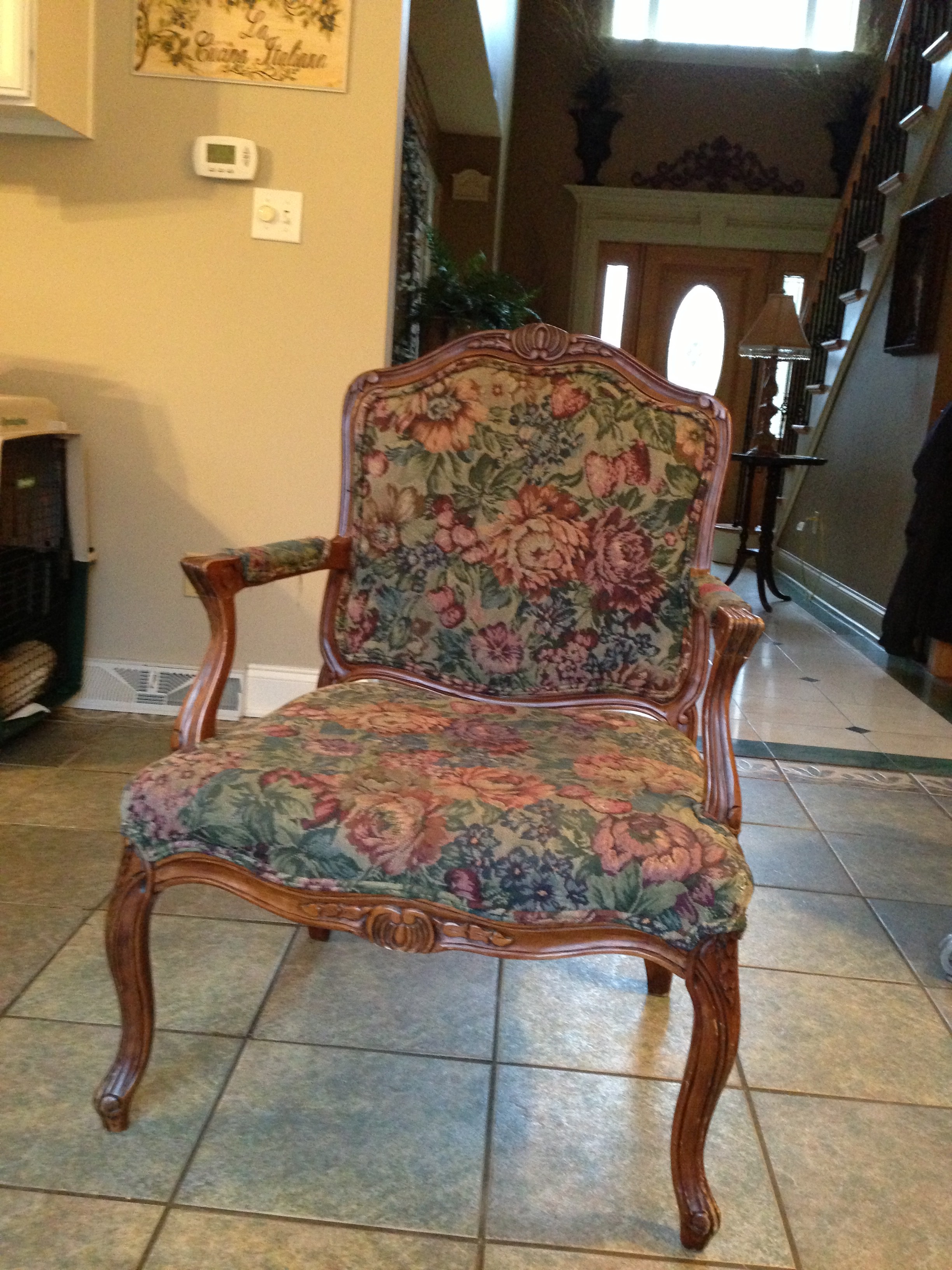
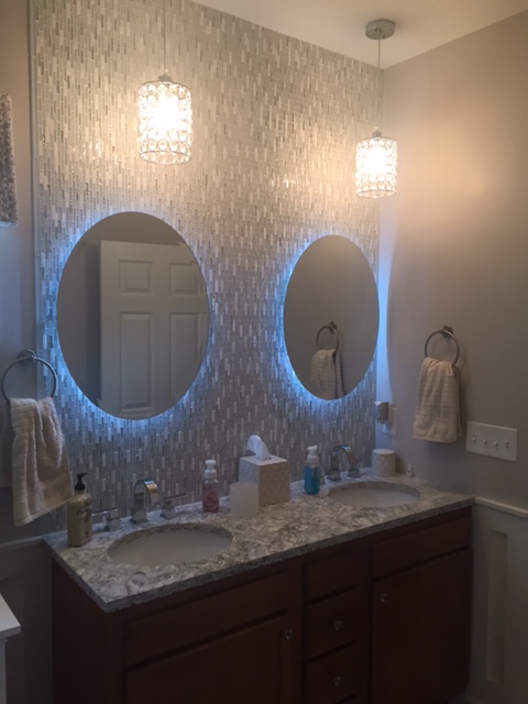
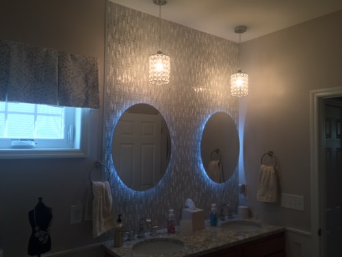
As we lean closer to closing out 2017 and look forward to welcoming 2018, the cliche’ that a house is never finished comes to mind. The trick is to find a way to put it all together so it feels complete.
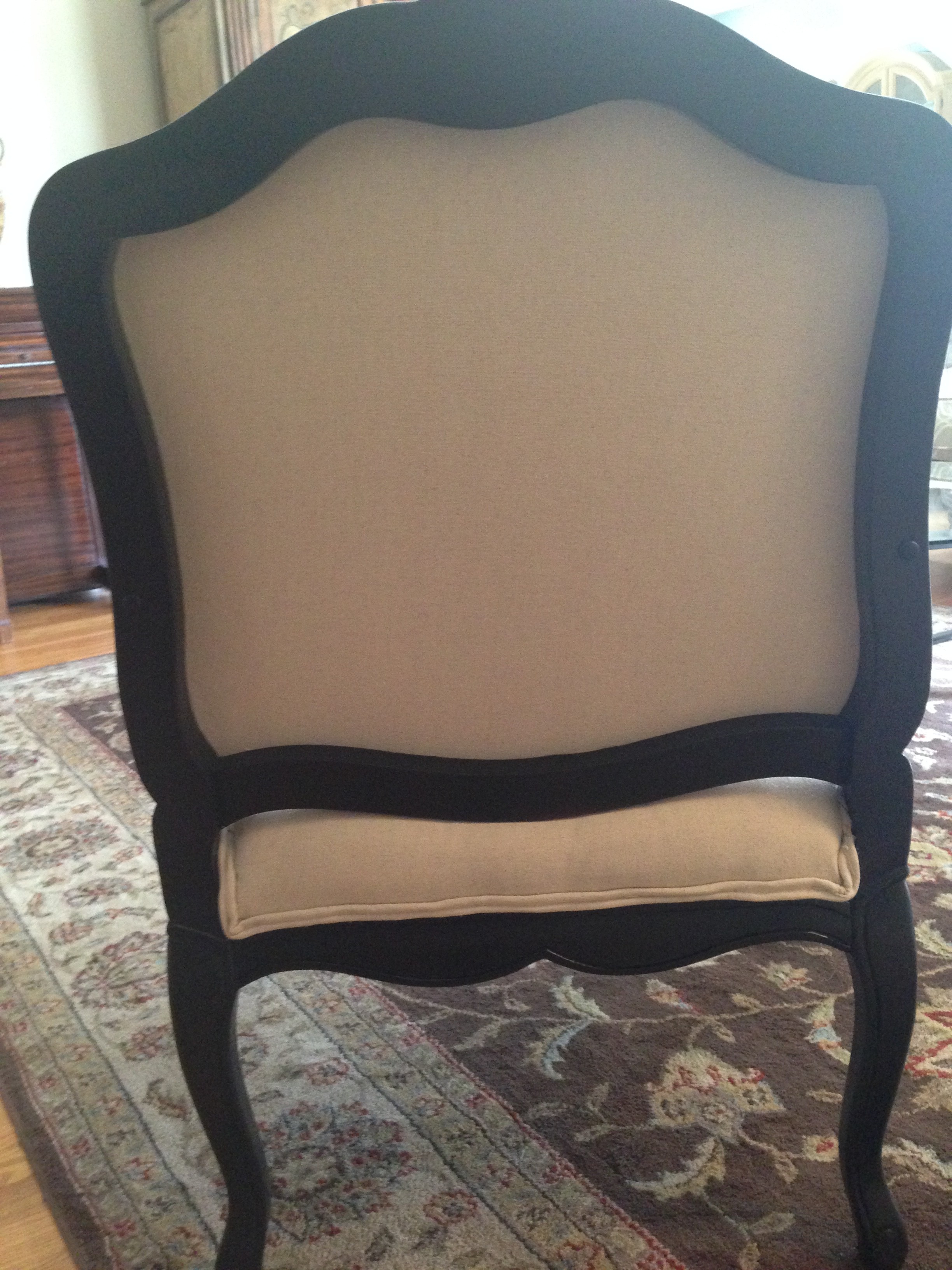
 

Painted Cabinetry 

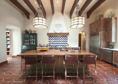
While open floor plans are still working in most new builds, I’ve definitely witnessed the coming and going of many trends and period styles from English Country to Midcentury Modern. But I feel we’re post trend now. I think current design allows us the freedom to incorporate history in an unfussy contemporary way. When choosing kitchen cabinets, the easiest way to accomplish this is to mix finishes. Choose a lighter color for the perimeter cabinets and another darker color for your center island. Your eye is naturally drawn to the darker cabinet finish, while the lighter shade cabinets against the walls will make the room appear larger.

merillat maple mist

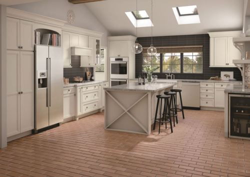
Always in-style are painted white cabinets, they have dominated kitchen design for easily the last 5 to 10 years.  Many homeowners considered it to be an easy choice.  White kitchen cabinets have a certain timeless quality and always brighten up the space. As a neutral color, white cabinets also played equally well with cooler walls. And while we will never see painted white cabinets go out of style, a couple of new color trends have started to pick up steam in 2017.

Merilatte Shale

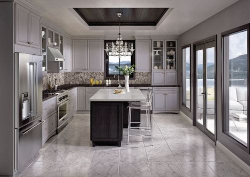
First, we have started to see a slight shift away from white, and moving toward gray.  Gray shares many of the properties that people love about white, but in a slightly more subdued tone.  While lighter shades of gray will never brighten up kitchen in the same way that white cabinets do, many come close, like Merillat Classic LaBelle in Maple Shale.  As a naturally neutral color, gray will also look good alongside warm or cool accent colors.

merliatt urban industrial

In the past few years we’ve seen former warehouse carts being cleanup and re-purposed as coffee tables across suburbia.  Just like other rooms of the home, more and more elements of both traditional and industrial design will enter the home kitchens space.  A coming together of the best of both worlds!  We’re already seeing this trend of traditional shaker cabinetry, being topped with concrete counters, combined with a farm sinks, and topped off with a tall, goose-neck faucet that would be at home in any kitchen…Elements like brick along with wrought iron stools help accomplish this industrial look, while the Merillat cabinetry: Sutton Cliffs in Hickory gives this kitchen elements of traditional style.

Talk with a kitchen and bath designer about how to create a unique space in your home! What styles have you seen start to emerge this year, or which do you think will start to really take off in 2018?  Tell us in the comments!


As always stay tuned for more Adventures in Styleland…


XOXO

Michele Conti

Read Full Post »

As a designer I must admit I am addicted to design trends and 2017 is quickly approaching.. I think now is a great time to start exploring what trends are already shining through:

color-trends-2017-deep-grey

Organic color pallets – Muted, blues and greys still shining, with more organic and natural influences this years pallet will have deep greens, deeper greys and steel blues. There Back…..Deeper Jewel Tones! Deep colors are the best way to kick up a traditional space.

Archiexpo

Cork – As a designer I am very attracted to natural texture. Cork does double duty. It creates warmth in rooms while adding texture. To add another excellent element to this already shinning star, cork absorbs noise in our increasingly open and larger homes. In a home office or luxurious bedroom this trend is often a overlooked design element. Cork brings a unique story to any part of your home. The natural but soft texture of cork complements every style.

home-bar-1Home Bars – This latest home trend raises the bar on what was once considered only for the uber wealthy. Home bars are now becoming the norm.  At the end of a tough day at work, coming home and popping open a beer or decanting a glass of wine is a great way to unwind, but there’s just something special about making a cocktail at the bar.

mid-century-meets-traditional

Vintage goes Modern – In design, what goes around comes around. … start heading on over to your local vintage furniture store now to grab some great finds. Burled wood of the art deco period, classic campaign furniture and other vintage looks were front and center at High Point again this fall. Historic pieces and mid century modern are still going strong.

beautiful-bedroom-ideas-upholstered-headboards

Upholstered headboards – Expect more of this glamorous look, with luxurious fabrics and tufted bed heads. This trend is very versatile, and fits into any room. Nail head’s to tufted buttons, upholstered headboards are an instant way to update your boudoir. Tailored lovely and very desirable!

terracotta-bordered-tile

Terracotta – The color is already prominent in fashion trend this fall, but this is not your mamas tile! Tiles with a matte finish are used on feature walls and fireplaces. The tiles are bordered and in uniquely warmer hues with added texture.

With only a few months left in 2016, trends in 2017 for your home are already arising! Forecasters and designers are rolling in with the newest and hottest trends for your luxury home. So if you’re thinking about or already renovating or building your own luxury home, these are some trends to look out for. Come visit me at the Home Expo for your renovation projects, let the pro’s help you, stop in and see me for some inspiration! in booth 328.  We have a variety of experts on hand to talk to, so bring your ideas and let them help you complete your list.

Stay tuned as always for more Adventures in Styleland…


XOXO

M

Read Full Post »

This recently completed master bath renovation was in a newly built home. The owners were happy with the layout of the bathroom but, wanted to punch it up a bit! The master bathroom should be your sanctuary, as stylish as it is soothing. We wanted to turn the existing bath into something unique.

I’ve rounded up a stunning way to create the dream bath that they would love being in. This bathroom was to be transformed into a peaceful escape reserved for the masters of the house.  With stunning tile work, soft fabrics and a calming color palette blend to form a decadent space designed for relaxation.

I started wall a gorgeous tile, the moment I saw this glass tile I knew.. this was perfect. And I was right, the owners squealed with excitement when I presented my ideas and finishes.

We chose a white glass tile, Jeweled j-603 in diamond white: The combination of finishes on the sheet of tile are clear glass,  wavy glass, frosted glass and marble,  it is exquisite.Jewel tile

The countertop, I used is  Cambria: Berwyn, this silver flecked stone adds a soft yet glamorous touch to this master bath.

Cambria-Berwyn

The Delta Vero Lavatory Faucets with waterfall spout, gives the right touch of sophistication to this charming master bath without breaking the budget.

IMG_6884

I took the bathroom mirror and lighting under the microscope to show how this bath accessory can change the ambience of your bathroom. Remember the main task of lighting in the bath, both direct and indirect is to caress and compliment you.

What do you think about illuminated mirrors? I used the LED Strip lights to back light the mirrors in this design, providing illumination as well as visual style above the vanity’s white under-mount sinks and quartz countertops.

IMG_6886

Two glass jeweled pendants hang above the double vanity adding a bit more interest and an elegant look.  Its tailored, not to girly for a man, and has a upscale feel in a restrained way.

IMG_6883

The lighted mirrors are remote controlled to fade to different colors and also soften or brighten with a touch.  The darker wood cabinets provide a subtle contrast with the lighter tiled floor.

IMG_6880

“It is a very luxurious spa like experience in this bathroom” the homeowners said when the project was completed.

It’s the details that give this Master suite a luxurious touch. I was hoping to create the sense of a 5 star hotel, it’s very important I think, that is  the experience you have when you walk into this space. This space is serene and peaceful, you have the same experience in the master bedroom.


To visually connect the master suite each room plays off the colors and fabrics of the last space. Though they’re usually hidden behind closed doors, master bathrooms deserve to be as thoughtfully decorated as your home’s living spaces.


As always, stay tuned for more Adventures in Styleland!


XOXO

M

Read Full Post »


In honour of mothers on their special day, I asked myself what decorating secrets did I learn from my Mom…

mom carol and I

She made our home beautiful, chic and inspiring while juggling both a full-time job and being a mother. I learned about fabrics and sewing from my mom. She was an extraordinary seamstress. When I was little, I loved going to the fabric store with her — it was a world of imagination and creativity. She taught me to appreciate quality, natural fibers like wools, silks and fine cotton. Now working with fabrics is one of my favorite parts of decorating.

Another important lesson she taught me,  never to buy what I don’t need: a bargain is only a bargain if it’s something important. I also learned all about color selection and furniture arranging from her. We lived in Brooklyn NY in a 6 room apartment, she always kept it fresh, ever changing.. and I firmly believe that had this wonderful woman been any less interested in our family home as I grew up, I might not be where I am today.

My mother taught me that it’s important to develop personal style,  buy the best quality you can afford and mix family pieces, antiques and comfortable upholstered furniture– eat in the dining room, use your china or better dishes on Sundays.. I learned to respect our home and everything within it, including my mother.

My mom used to rearrange the furniture a lot — it’s surprising how furnishings can look completely new when viewed from a different angle or in a different room. She also taught me that every window looks empty and cold unless softened by a window treatment, she changed hers often.

She was never afraid of bold patterns, I remember her sewing room or the SPARE ROOM, we had large orange and yellow wall paper, and smaller floral wall paper on the ceiling.. It was cutting edge at the time..

When I was little, my mother always dressed — she was glammed up even when cleaning the house. From her, I learned to dress and decorate with the intent to be gorgeous, having no fear of color.

I will end here with a couple of ideas for what to do for your mom..

Source and pay for a house cleaning service for a few months. A house cleaning every two weeks, I’m sure all moms would appreciate the break. That being said, do not buy her a vacuum, cleaning supplies, or tools unless she specifically asks for them. I’m looking at you Dad.

Brunch was always a favorite of mine.. I loved to go to a special Italian place locally that served cured meats..fresh fruits..baked delights and my family would all laugh and enjoy the meal together…

table scape

Spend time, yes…time… take the day and pull out pictures, family vacations reminisce with her, make cookies sit and have a cup of coffee.. Love her and let her know that she is the most important women in your life.

Mom and Dad


Miss you Mother Theresa…All my love


XOXO


M


Read Full Post »

Revere PewterChoosing a wall color can be fun, its all in the approach….and help from your painting professional! While doing a room for Vanguard Showhouse, I was asked to do a tour through the house and talk about the paint colors. As National Color consultant for Certa Pro Painters, I was happy to lead the tour.

One of the first questions was:

Q : What is the lovely grey color on the walls? And how do I know if it’s right for my home?

Paint colors

A: The question-of-the-day on the house tour was ‘What color are the walls?’  The answer was Benjamin Moore’s Revere Pewter.  Once I answered, nearly everyone who asked the question, replied “This can’t be Revere Pewter !  I have used that color or have sampled Revere Pewter and this is not what it looked like.”  Although each person’s experience with Revere Pewter was different, the consensus was that the color looked great in this home.

Certa Pro Banan Boat

Selecting the right paint color for your space is a process that takes time and a number of steps to achieve.

There are many factors that can affect paint color:

  • Natural light : the direction the light is coming from (northern exposure and eastern exposure each provide a very different quality of light),
  • Artificial light : will you have incandescent, fluorescent, or LED lighting?  Or a mixture of some or all of these?
  • Surroundings : what furnishings, artwork, draperies, rugs, and hard finishes are there in the space?  Each of these factors will have an influence on the wall color.
I always recommend hiring a Professional Painting Service. At CertaPro Painters they know the highest quality paint products to use with the right finishes that will enhance your walls. With this expertise, they will recommend these products to you to ensure that your painted surfaces look their best and stay looking beautiful for as long as possible.
Certapro painters

Paint colors should be selected in the space they will be utilized.  Look at the color swatches next to the fabrics and finishes intended for the space.

  • Start by finding a few (2-3) options for each space.
  • Ask your decorator or Painter if he/she can order larger color sheets for you, BM has 18 x18 and Sherwin Williams has 8 x 10
  • If the large color sheets are not available, ask the paint store to mix the smallest quantity for you (in the intended sheen) for each of the options you have selected.
  • Paint the colors on a board such as poster board, or some spare drywall pieces.  Painting on the wall may seem like a great shortcut, however as soon as you put 3 big splashes of color on the wall next to each other, each of the samples is affected by the other colors, and are therefore not rendering true.  Another reason to sample on a board is that you can carry the color from room to room, as well as from wall to wall.  The color will look different on a wall with a window than a wall opposite a window than on the ceiling.
  • Seeing the color in multiple locations, and at different times of day (with natural light during the day, and artificial light in the evening) will allow you to really study the color and decide which is right for you.

If you are still feeling unsure about the process and selecting the right colors for your space, please give Certa Pro a call they would be more than happy to provide a color consultation for just the one room you are ready to paint, or your entire home or commercial space. Set up your appointment for a free quote at the Home Expo Terri Gargano of CertaPro Albany will be at Booth 348 in the Times Union Center.

Stay Tuned for more Adventures in Styleland


XOXO

M


Read Full Post »

1024x1042
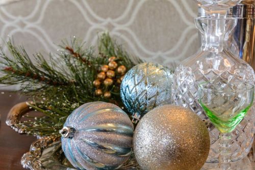
From our home to yours… Have yourself a Merry Christmas.. See The article on our home in 518LIFE

Read Full Post »

 Layering patterns involves four main elements: color, scale, shape and texture. If you’re like me and you fall in love with four times the amount of fabric you need at a showroom, you’ll need to go through some major editing. First up is color. Lay all your possible choices out on the floor and if certain ones look a hot mess and just don’t play well with others, remove them from the mix right away. It’s kinda like kicking an obnoxious reality cast member off the island after an elimination challenge but with fibers and weaves versus emotions and bad behavior.

Here’s an example of a great color edit. Notice how each of the fabrics sports different shades of a common color, blue? This is what you ultimately want; the varying intensities lead to an evolved, effortless look. Something else that’s happening here is a great mix of shapes going in different directions.

I borrowed this picture below from Ballard Designs.

Traditional

A traditional rug doesn’t have to define your space. Add in updated prints and colors pulled from the rug for a wonderful eclectic look.

1.) Carlson Rug
2.) Claire Gray
3.) Felicity Spa
4.) Lorenzo Charcoal
5.) Bark Twill
6.) Danish Linen Oatmeal
7.) Natural Microfiber, Bark Twill, Indochine Stone

8.) Kravet Indochine Ikat Stone

Traditional Layering

Contemporary

Keep a monochromatic color scheme interesting with great patterns that play well together and fabrics with tonal texture, like Kravet’s Scandicci Gray.

1.)Kravet Indochine Ikat Stone
2.) Kravet Toscana Ikat Slate
3.) Lorenzo Charcoal
4.) Asha Pewter
5.) Danish Linen Tea
6.) Scandicci Gray (Kravet)
7.) Panthea Rug (Gray)

Contemporary Layering

 Add contrast. Once you have your main color selection down, in this case its Grey, add a bit of contrast. See the Suzanni fabric #4 with the gold and pewter.

Vary the scale. While color and shape are easier to get a grasp on, scale is a bit more complicated. There are three different sizes of scale: small, medium and large. When mixing prints, try not to choose more than one of the same scale size; multiple patterns of the same scale often result in a heap of Hodgepodge. The person who does this best is Betsy Burnham, if we were all as talented as this women the world would be pattern of loveliness!

The perfect mix. We’ve got a large-scale pattern sporting an orange suzanni pattern, a medium-scale blue plaid which is traditional, and the small scale cheater global animal print. The trio is also different directionally; the rug runs horizontally, in this ethnic/global zigzag like pattern. But all of these prints work well together!! Hopefully you can use some of these tips when putting together patterns in your home…

As Always stayed tuned for more Adventures in Styleland….

XOXO

M

M

Read Full Post »

Times Union Home Expo Banner


Home Expo 2015

Building a new home? Remodeling a room in your home? Well this year we have so much in store for you. Meet Jason Cameron February 8th, from the DIY Network. Watch our website for additional information on shows and events. My name is Michele Conti I am a local Designer/Blogger in the Albany Area! I will be here for the next few weeks, sharing information about the home expo, giving you DIY ideas and little blurbs about some of the Vendors and shows that the exhibitors will schedule during the expo. Check out our link on Times Union Home Expo. Below is a quick and easy DIY project for you… With a little help from Behr Paints available at Lowes located in the Times Union Center booth 284-285 this crafty idea was a breeze!!

Couch Seating DIY

Check out the Times Union Home Expo 2015 Web site and read my blog everyday now thru February 6th for great info and DIY projects!!

Chat with you soon!!!! Stay Tuned for more project information!


M

Read Full Post »

It’s Furniture Friday!!!! I wanted to share this great find with you. I was in Buffalo NY visiting family.  One of my favorite haunts there is the Salvation Army at 252 S Cascade Dr, Springville, NY 14141. I always stop there. They seem to have a treasure for someone I’m currently working with.  Well on this Adventure in Styleland I found these:

Fabulous Find

Fabulous Find

My Goal was to transform them into the Louis the XV Salon chairs that I found on Ballard Design. Two of these beauties for only $10 how could you beat that! And so the project begins, here is a quick picture tutorial it took about a week to do both chairs.


Louis the IV Chair

Louis the IV Chair


Although these chairs retail for $700, the thrift store chairs look amazingly similar, almost exact same frame…

Removing the cording

Removing the cording


You can see the thousand staples used to attach the cording, this is only the beginning oy vey!! When asking Gabe to help with pulling the staples, he took pity on me, and I thought OK Green Light!!!  When my husband agrees to a project in our home (and by that I mean agrees to open his heart and sometimes his wallet to help me ), I act quickly.

Experience has taught me that green lights all too quickly turn yellow. Then, before you know it, there’s a big, fat red light staring at you through the windshield of your dreams.
When that happens, you are left with two choices… delays or apologies.  Trust me, it’s best to act while the light is green. Get Help when it’s offered!!!

IMG_0017


The fabric had just as many staples as the cording,  I will admit that by this time my fingers were a tad sore. The fabric came off quickly with Gabe’s strong hands… and before you know it we were down to the frame working together..

IMG_0025

Finally!!!! all the staples out and it was time for spray paint!!


The spay paint that I used was Satin Black from Rust-Oleum.

Black Spray paint for Ballard Chair Makeover

I spayed the frames with two coats and let them dry for a day before I began to start covering them, this also gave my hands a break, because at this point I was on my own, and was determined to finish these by the end of the week!

I decided to use drop clothes to cover these chairs,   I’ve always wanted to use drop cloths as a slipcover (from Martha Stewart’s magazine years ago). This was my opportunity, here is the what I used:

10 oz. drop cloth

10 oz. drop cloth

I washed and press the drop cloth first.  I used the old fabric we removed from the chair to create a pattern for the seat and back.


IMG_0113Stapling the fabric was a little tricky, I needed to pull it tight and staple it as I went, this didn’t always go smoothly, I had to remove some staples a couple of times because the fabric would pucker, but after you get a rhythm going, it goes along quickly. I did sew the fabric cording, and decided to use a black gimp on the arm pads.

IMG_1754

Here is the finished product (pictures are not professional). This was an easy project total cost was about $60! What do you think??


IMG_1753


IMG_1751


IMG_1743

Here is a picture of the living room where the chairs reside now,  complete with our Chocolate Lab Chino to compliment the brown in the room! Another project done!!


Stayed tuned for move Adventures in Styleland!!


XOXO


M

Read Full Post »

Green Interiors

Green Interiors

This life is short, but very, very sweet. I’ve been dealing with a couple issues in my life recently, Mother Theresa passing, my daughter Giovanna leaving for college and taking on a job in an office, to help with college tuition for Gi. The office is nice, the girls are so sweet, (well, most of them) and the Gentleman who owns the business is young , good-looking, a talanted surgeon and a great guy!

But I’m missing my design friends! well to be quite honest, I miss being up on the ladder, in the middle of my designs, with the noisy construction workers that I just can’t leave alone,because I constantly have to put my 2 cents in !!  I miss Wednesdays at Denise Maurer Interiors, with Betsy Mattice and Patty Miller, but most of all I miss sitting at my computer during the day and taking a few minutes to blog to you and share my projects, ideas and news about whats got my attention in the Design World!!

I’m rethinking taking on this extra job, its taking me away from my first love, Design so maybe just working harder at my current business will bring in the extra cash for Giovanna’s education! Some new ventures have come my way, one is a great women I met through the internet. I am looking forward to meeting Carol from Green Interiors in person. She is a client that has opened a Green Design store in MA. The name is Green Interiors! She is coming to my neck of the woods for a couple of hours to meet with me and see my workroom (which is pretty impressive if I say so myself) .  We have been talking by phone for a couple of months and I have enjoyed our early morning conversations, starting our days off sharing ideas and working together to get projects on track,  and collaborating on designs. I can’t wait to meet her, I know we’ll hug and get right down to business.  No chatting about the weather and good local shopping.  We’ll get straight to the heart of things…our faith, our businesses, our families, our journeys, our struggles, our dreams for the future.   Conversations like that are good for the soul.  It’s amazing the kind of connections that are formed through this crazy social media and blog world.

Well, I’ve learned that when you meet internet friends, you bring a gift, so I’m bringing her one of my amazing bags made of vintage fabric. that my friend Kitty makes. I can’t wait to see if this Adventure will bring me back to Styleland full-time!

As Always, Stay tuned….

XOXO

M

Read Full Post »

Older Posts »

Jenny Komenda

Design, Fashion and Food!

Just Imagine ExtraOrdinary

Reimagining the ordinary in homes, gardens and our lives.

Your Modern Couple

the design blog you never knew you needed

A Little Bit of Boondock Life

Just another day in the middle of nowhere...

Frugal with a Flourish

Design, Fashion and Food!

Clover Lane

Design, Fashion and Food!

somethingville.com

where my ideas come to life