Feeds:
Posts
Comments

Archive for May, 2015

 Layering patterns involves four main elements: color, scale, shape and texture. If you’re like me and you fall in love with four times the amount of fabric you need at a showroom, you’ll need to go through some major editing. First up is color. Lay all your possible choices out on the floor and if certain ones look a hot mess and just don’t play well with others, remove them from the mix right away. It’s kinda like kicking an obnoxious reality cast member off the island after an elimination challenge but with fibers and weaves versus emotions and bad behavior.

Here’s an example of a great color edit. Notice how each of the fabrics sports different shades of a common color, blue? This is what you ultimately want; the varying intensities lead to an evolved, effortless look. Something else that’s happening here is a great mix of shapes going in different directions.

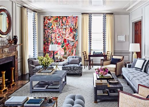
I borrowed this picture below from Ballard Designs.

Traditional

A traditional rug doesn’t have to define your space. Add in updated prints and colors pulled from the rug for a wonderful eclectic look.

1.) Carlson Rug
2.) Claire Gray
3.) Felicity Spa
4.) Lorenzo Charcoal
5.) Bark Twill
6.) Danish Linen Oatmeal
7.) Natural Microfiber, Bark Twill, Indochine Stone

8.) Kravet Indochine Ikat Stone

Traditional Layering

Contemporary

Keep a monochromatic color scheme interesting with great patterns that play well together and fabrics with tonal texture, like Kravet’s Scandicci Gray.

1.)Kravet Indochine Ikat Stone
2.) Kravet Toscana Ikat Slate
3.) Lorenzo Charcoal
4.) Asha Pewter
5.) Danish Linen Tea
6.) Scandicci Gray (Kravet)
7.) Panthea Rug (Gray)

Contemporary Layering

 Add contrast. Once you have your main color selection down, in this case its Grey, add a bit of contrast. See the Suzanni fabric #4 with the gold and pewter.

Vary the scale. While color and shape are easier to get a grasp on, scale is a bit more complicated. There are three different sizes of scale: small, medium and large. When mixing prints, try not to choose more than one of the same scale size; multiple patterns of the same scale often result in a heap of Hodgepodge. The person who does this best is Betsy Burnham, if we were all as talented as this women the world would be pattern of loveliness!

The perfect mix. We’ve got a large-scale pattern sporting an orange suzanni pattern, a medium-scale blue plaid which is traditional, and the small scale cheater global animal print. The trio is also different directionally; the rug runs horizontally, in this ethnic/global zigzag like pattern. But all of these prints work well together!! Hopefully you can use some of these tips when putting together patterns in your home…

As Always stayed tuned for more Adventures in Styleland….

XOXO

M

M

Read Full Post »

guido Guido was one of my favorite cousins growing up in Brooklyn. Now living in Upstate New York one of my favorite places to visit is Guido’s Ice Cream Parlor in Albany..  Recently I  thought… why can’t we eat ice cream for breakfast????  how is it that different from milk and cereal, except in format?   Guido's Italian Ice Should some foods — like ice cream  — be off limits for breakfast?   I think not!  L.O.L…Let me say that ice cream is one of my favorite foods in the whole world; I like all kinds, with all sorts of toppings, and I have been known to find reasons to partake in this yummy treat multiple times within a single day. I mean compare your yogurt and your ice cream label…or your granola and your cone ingredients (or sugar content)! It’s all a numbers game my friends….   Growing up in Brooklyn, Italian Ice runs in my veins! This past weekend we had family in for the weekend so we headed out Saturday to Guido’s for some Italian Ice and to pick up some ice cream for home. Last night we finished dinner and brought out the ice cream from Guido’s for desert…. it was so much better than the supermarket ice cream that we normally have on hand. As we dished some out, my niece decided she wanted hers in a cone… guido's ice cream       I can honestly say I have never seen someone eat an ice cream cone by starting with chomping into the cone just below the ice cream . When I saw this we realized there was no way to salvage the situation so we just let the little honey bunny eat the cone in whatever way she wished.

She finished the whole thing………………………. then she had a bath………………………………. then we did the laundry..

I’ll end here today with this thought when I grew up we didn’t have a dishwasher, I’ve found that some shortcuts in life are worth it. And eating ice cream off paper plates is one of them.

Stay Tuned…for more adventures in Styleland…

XOXO

M

Read Full Post »

Natural Linens and sisal rug give this charming bedroom and unfussy look…

natural linen

Our eye takes in the Draperies and Wesley Hall chair in King Textiles matelassé. Corsican iron bed. Pillows and bedskirt in Jane Churchill floral. Bedspread in Chelsea Textiles cotton. Visual Comfort lamps. William Crutchfield botanicals. Halo Styles bench in muslin.

California living

Steve Giannetti, share pictures of their home in CA, Outdoor spaces blend seamlessly with interiors. Lantern, Troy Lighting. The lantern seems such a little detail, but in this design its a focal point…

details matter most 1

 The Greenwich, Connecticut, home of former Sony executive Tommy Mottola . For Mr. Mattola, things are never done half way..He believes “Great returns require great investment and the devil is in the details”.  “It’s the little things that matter,” says the man who guided the careers of Billy Joel, Gloria Estefan, Jennifer Lopez, and his former wife Mariah Carey, among others.

details matter most 2

This apartment is located in the Upper East Side in NYC. The renovation by Steve Gambrel. Gambrel’s efforts at “younging up” the traditional interiors, as the designer playfully puts it, he made strategic use of high-gloss finishes, including on the ceilings of the living and dining rooms. “The millwork and plasterwork were so elaborate they could have been perceived as fussy,” he says. “Our solution was to lacquer the extravagant details to give the rooms a more modern feel.”

If Beauty is in the eye of the beholder than I say that the most liberating thing about beauty are the details, they empower us to find beauty where others have not dared to look….

Stay tuned..
XOXO
M

Read Full Post »

Jenny Komenda

Design, Fashion and Food!

Just Imagine ExtraOrdinary

Reimagining the ordinary in homes, gardens and our lives.

Your Modern Couple

the design blog you never knew you needed

A Little Bit of Boondock Life

Just another day in the middle of nowhere...

Frugal with a Flourish

Design, Fashion and Food!

Clover Lane

Design, Fashion and Food!

somethingville.com

where my ideas come to life