Feeds:
Posts
Comments

Posts Tagged ‘Interior Design’

If you really want something special and unique in your home than decorative painting is the way to go. In many Designer showhouses you’ll find the work of talented artists that use decorative painting techniques.
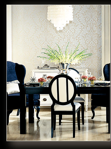
The origin of decorative paint is unknown, it has been seen as far back as cave paintings. The greatest influence has been the early Christian or church art, frescoes that were first found in roman catacombs. Folk art then started and decorative painting began to have a revival in the 1940’s and 50’s. It has also been popular in countries like Scandinavia, particularly Sweden, has a rich history of painted interiors and furniture. In England and France, the country tradition was less strong but, it is from here that some of the finest works in the classical tradition emerged.. Chinoiserie lacquer work, gilding, hand painting and faux finishes on walls and furniture all carried out in grand country houses and châteaux.

Chinoiserie

Here is a step by step process of a Grand Damask Pattern I did in a clients 2 story foyer.

This space originally started with a Waverly Wall Paper that was a colorful paisley pattern with blues, greens, pinks, and yellows. Quite bold and the home owner loved it for many years but remodeling her kitchen and updating the family room off the foyer, called for something more elegant with a transitional twist.

We decided to do a Stencil with a metallic layered damask and this was the start of our adventure:

Upper Foyer Landing, first layer BM af-305 Ylang Ylang

Supplies needed for this finish are:

Base Coat: Ben Moore Ylang Ylang AF-305

Ben Moore Metropolitan AF-690

Ben Moore Cotswald AF-150

Premixed Joint Compound

Modern Masters Metallic Paint: Silver (add an 10% Extender)

Lamp Black Acrylic

Faux Effects Aquacreme/Mastercreme

Faux Creme Colors Van Dyke Brown and Dark Brown

Tools: Japanese Trowel, Stencil brushes (large), chip brush and spray bottle

  1. Create 2 separate mixes of 1 to 1 ratio of paint and premixed joint compound using Ben Moore Aura Cotswald AF-150 and Metropolitian AF-690.
  2. Trowel Paint colors Randomly, with a vertical pattern, don’t overload your trowel with mixture.

Step 3: Joint compound mixed with Aura Cotswald AF150 and Metropolitan AF690 Second Layer

3.   Trowel second layer, using both colors again and working wet on wet. Use a spray bottle of water to spray surface, then apply causing mixture to drip lightly. Let dry.

4.  Stencil Grand Damask Motif randomly over the surface first with Modern Masters Silver.

Production Stencil, 2nd floor foyer, modern masters Silver metallic

5. Stencil additional Grand Damask motifs with Lamp Black, adding silver again over black here and there.

Adding Lamp Black with touch of silver, over Stairway, Whew!!

6. Thin the Metropolitan Joint Compound mixture 1 to 1 with water, using a chip brush apply this in  vertical drips from the top of the wall. Do this by loading the brush well and pressing it hard onto the surface to release the paint mixture. Allow to dry.

7. Mix Aquacreme glaze at a rate of 1 cup Aquacreme to 2 teaspoons each Vandyke and dark brown creme colors. Thin this with 1 to 1 water and apply in drips from top of wall to bottom with a large chip brush. Allow to dry slightly and spray with water, using the chip brush and additional glaze on spray water here and there to keep glaze open and make it drip more.

The glaze and van dyke brown mixed with dark brown push the stencil back and create a great strie on the walls giving an aged look to the walls.

The finished Foyer was Spectacular!! It had an aged appearance with a modern feel. Loved the look, and transformation! Just another adventure in Styleland, hope you enjoyed this one!

Stay tuned as always,

XOXO

M

Read Full Post »

Read Full Post »

Good Morning and let’s welcome another week of frolicking and  summer fun. I can’t believe its June already!!! Summer is here and life is in full swing!! Some great design ideas for Summer entertaining! We’ll start with Bellini’s my favorite! I love serving cocktails on the deck on a great summer day!

Kiwi-Strawberry Bellini Makes: 8 servings

4  Kiwi

16 Strawberries

1 (750ml) bottle Prosecco
Remove skin from kiwi fruits, cut into quarters.  In a food processor or blender, puree until smooth. Remove  stems from strawberries, cut in halves.  In a food processor or blender, puree until smooth. Spoon kiwi puree and strawberry puree onto the bottom of champagne glasses, about 1 to 2 heaping tablespoons each.  Pour over fruit puree and enjoy.
*Note: you can substitute Prosecco with sparkling white grape juice for a non-alcohol version.

Summer is here at last and so is lingering in summer spaces. The photography that Horst shot for Vogue and House & Garden in the 1960s, 70s and 80s has such enduring appeal. Right now, I’m drawn to spaces with summer-style. I hope you are finding time to linger in summer spaces, too.

Here is a view of  Schoon Lake in New York. On this beautiful site Eagle Capital Group is building a Spa and Resort,  to be named”StoneLedge”.  Myself and Maurer Interiors will be helping with the interior design of this project. We were so excited to share this vision with him. What a slice of heaven!!

Just a few outdoor spaces to end today!!

As always stay tuned….

XOXO

M

Read Full Post »

I enjoy entertaining, one of my favorite things to do is to create a beautiful tablescape, I feel so great when guests come into a room and that look of delight comes over them.

This coming weekend is Palm Sunday, so the thought of how to decorate my table was on my mind. I have a beautiful Forsythia bush in my yard that is so beautiful this year, we have had warm weather and it has bloomed early so I thought I could start there.

Color???? Well I usually use a green china that I have for spring, but this year I will not be home for Easter Sunday, I thought we would really set an elegant table with Mother Theresa coming for Palm Sunday dinner. Tradition and faith are a big part of this household (as I’m sure you’ve discovered, if you read my blog), I have my menu planned, and my tablescape already decided.

 To begin, you must make the decision that the iron is your friend, I know, I know we don’t really feel that way but in this case your table should start off with clean crisp linens that are flawlessly ironed. It’s kind of like cooking a great meal the freshest ingredients make the dish, so it goes with a table the linens will shine through all the glamour that will adorn your table.

My choice of plates, black and white china for this occasion I decided to do gold chargers, I love to use chargers I feel that they pull everything together and really add a sense of elegance or whimsy (depending on the occasion).

So here we are Mother Theresa’s silver and a touch of crystal. Wella!!! We are done!!

Now for a full view!

What will you do with your table for Spring. I hope I’ve given some inspiration to you, enjoy the holiday!! As always stay tuned…

XOXO

M

Read Full Post »

Spring is the perfect time to give your home a fresh look. From serene shades to vivid hues, I have 5 color schemes you’ll want to try this season. Turquoise and tomato red according to some design experts are new hues for this season. I know turquoise??? red????? haven’t these colors been popular for a while?? Well, yes but it is definitely the HUE, that so subtle difference in color that creates new trends, and also the way we pair colors together that creates news. Here is a great example of the new pair that was a color faux pas in the past, pink and red.

Red and Pink spring color pallette

Pink and Red???

Don’t shy away from color this season. Designer Erinn Valencich pairs classic red with hot pink for a bold bedroom design. By using gold and cream in the bedding and wallpaper, she keeps the vibrant shades from overpowering the space.

Clean and Crisp!

Spring hues are ideal for a girl’s bedroom. Using a polka-dot pillow as inspiration, this designer uses a focal wall to set off the room.

Damask fabric in apple green complements the vivid pink wall, while a white headboard and bedding give the space a crisp, fresh look.  I just love Damask, its one of my favorite patterns.

Having two girls of my own, pink is a color that has adorned their rooms for many years, it is always in style for girls, from nursery to teens and beyond.

Bright colors

One of the most appealing shades of spring is the deep blue found in this bedspread. It’s combined with other favorite hues, like tomato red, turquoise and apple green, to create an energetic and bright design.

The mix of patterns here is just exquisite, when pairing patterns small and bold always work with a linear stripe. The pop of white in this headboard again keeps that crisp sharp feeling in the room.

Blue and Yellow

The classic blue and yellow combo is always a favorite. While white is often paired with this palette to keep it light and airy, black accents to create a richer, more sophisticated atmosphere.

Serene Green

Pairing together a calming relaxing green with neutrals are a safer choice and using deeper hues of the same shades as accents, create a great space and inviting atmosphere.

Yellow and Grey

This trend is so popular I have added two pictures for you!! Loving the fresh bright sunshiny yellow paired with the subtle grey!!

Neutrals continue to flourish, as companions for brighter hues or as standalone, monochromatic color schemes.

Which neutral might just surpass brown as the favorite? Gray. And it covers a wide range of hues, which span soft gray to charcoal to hematite, and gain interest from metallic and pearlescent accents.

Green continues to gain strength from its association with the growing shift toward eco-consciousness. It will show up in everything from fabrics to accessories to countertops.

I hope you have enjoyed my forecast on whats new and upcoming in color!! As always stay tuned…..

XOXO

M

Read Full Post »

From the moment I started working on a design for my home I knew that this was something I was passionate about. I enjoyed exploring ideas, letting my imagination take over, no limits to what I could create in my mind. Of course my husband (who has been in construction for 30 years) is a great source of information for me. He always listens to my ideas and with his background in engineering and construction helps me bring my ideas to life!

I could only imagine…. That is how every design has started for me. My husband and I are soul mates, we dreamed of the home where we wanted to grow our family and somehow we were able to bring it from our mind to fruition. This was by far my biggest accomplishment in design, both my husband and I still sit every day in awe of what we have created.

Recently I have been working with Ted and Terri Gargano. They are a young couple who own a franchise called Certa Pro Painters, I was pleased when they asked me to come aboard as their interior design consultant. I have worked with them in the past and I appreciated their offer to use my talents to grow both Certapro Painters and my own deisign business. I love Envision Magazine, a publication that Certapro Painters puts out to inspire you, and also their blog, here is one of my favorite entries:

Colors for Fashionistas

Whether your home is a castle or condo, you can raise your status with these high society paint colors. Pamper yourself in decadent colors like Exclusive Plum or Gala Pink. Indulge in hues of Daring, or treat yourself to Champagne and Caviar- paint colors that is. What better way to live the dream than surrounding yourself with the colors of success.

CertaPro Painters is your home painting expert

We are professional painting contractors with an outstanding customer satisfaction and referral rating. That means our future is on display every day — in how we paint every type of house and building: interior, exterior, residential, commercial, office, and condominium.

Call 1-800-689-7271 for a FREE in-home house painting estimate.

I am so very excited to be associated with this great company!! We are now offering decorating services, from color consultations to room planning, we offer window treatments and all your design needs. Call if you would like to have us help with your project. Our office number locally in Albany is (518) 631-4116 or you can reach us at (518) 852-4185. Call today for an appointment!!

As always stay tuned…..

XOXO

M

Read Full Post »

Lynn and Kevins Home

Base color on this finish is ylang ylang. Other colors used were Metropolitain and Cotswald. The stencil was done in Modern Masters Silver and Lamp Black. So Many layers!!!!! This finish was such fun and the family that I worked with was so great!! Good fun great stories shared. I will update this post shortly with the recipe for this finish and step by step photos. Stay tuned as always!

M

Ylang Ylang Benjamin Moore
AF-305
Meaning “the flower of flowers,” tranquil ylang ylang is a calm, meditative yellow. Like the fragrance of the tropical Asian flower, this shade will relieve stress and anxiety.

Read Full Post »

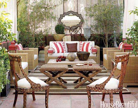
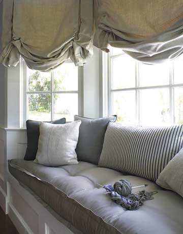
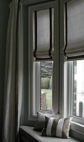
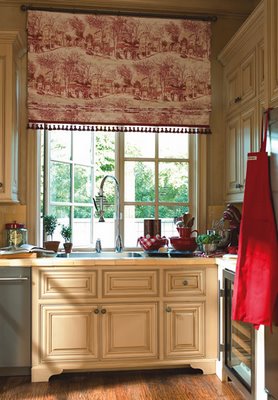
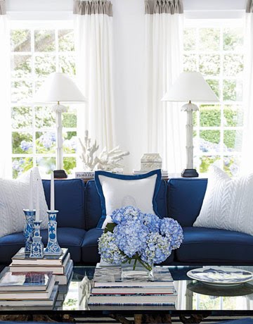
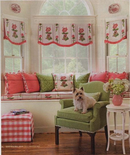
I have been doing alot of window treatments lately!! I just love seeing all the fabrics and creating such beautiful window dressings. Some of my favoite windows are Roman Shades and beautiful panels. Panels have been around since the beginning of time, but Roman shades have been extreamly popular lately. They are so versitle, they can be dressed up or made in a casual linen or cotton duck. They go in any space wether formal or casual living. Shades are ther way to go !! Here are some windows I love, Please Visit my Etsy store for ordering!! or call (518) 852-4185. Enjoy the pictures!!

Read Full Post »

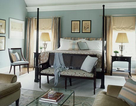
What makes a Great Bedroom???? This is a question I’ve asked myself again and again. The answers, for me anyway are, ambiance that feeling of calmness, a personal sanctuary. The bedding, furniture, lighting it should be welcoming, a retreat. A place that will see you through a sleepless night, where you can close the doors and take a deep breath and destress…. A place you can have marathon reading sessions, even illness seems better in this place.

But, what is in a Sanctuary aka bedroom that gives it this feeling?? It should be luxurious, welcoming calming with comfortable seating. In my bedroom I have a Sam Moore chair and ottoman by the fireplace. Lighting, a beautiful chandelier on a dimmer, soft task lighting for reading and just relaxing. Soft colors on the walls that help soothe your eyes and bedding….The softest highest thread count you can afford, 400 count sheets are priced so reasonably, goose down pillows, and down definitely down comforter….ahhhhhhhhhhhhhhhhh blisssssss…

Just some pictures to help translate what I mean:

Jeffers Design Group

House Beautiful Sanders

Jeffers Design Group

Watch for my article in Life and Home by Lee Nelson about bedrooms!!!!!! That’s all for now, Stay tuned……………………..

XOXO

M

Read Full Post »

I’ll start with a Thank You to Nathaniel Bette,  he is a remarkable man, his vision, perseverance, unending patience and good nature made this year’s showhouse such a great project to be involved in. When I first saw the home back in October, I was inspired to do a period design. Here are some of my early pictures of the room, when I first learned I was going to do the Guest Bedroom!  I loved the fireplace, recently one of the many people whose talents stand out in the restoration of this home,  is a gentleman called  CJ (who worked for Nate, over seeing many projects and also did the italian venetian plaster ceiling in the wine cellar), he mentioned that the marble used for the mantle on the fireplace was rare and is no longer available, it’s characteristics  are similar to Grigio Carnico in color and veining,  this is fireplace is stunning. The view from the Guest Room windows are of the Helderburg Mountains. The artwork above the mantel mimics the hills and valley’s preceding the mountains , which is what you see from the endowment, out the south window of the room.

The walls were painted by Jason D’Amrbosi for me, he was again one of the many artisans that took part in this transformation. The color on the walls is Lunch Bag, from the  Martha Stewart palate. Benjamin Moore donated the paint for this space, Thank you to Miller Paints in  Latham, NY!!  The finish we chose for the walls from Faux Effects, it is a troweled finish called Luster Stone. 


Working with Mary Beth was terrific. We adjusted the gradation of color in the Luster Stone with the tint formula (provided by Ben Moore) and the walls were transformed into suede, the subtle depth that I conjured up in my head was there… perfection. It was as if the layers of plaster took on a pearlized finish, the soft shade was so alluring. We did this finish in two days, the first day we taped off the ceiling and moldings. The tools we used were a textured roller and trowel. Once we applied the luster stone onto the wall we used a trowel to tight trowel off the product and create a smooth textured look. It was all coming together, loved the Gray Cashmere on the ceiling it was the perfect back drop for the ceiling medallion… we were ready for  draperies and furnishings!!

Finding a Bed for this room was a passion,  I was looking for a focal point in the design, this piece of history from the Civil War, belonged in this house and was perfect for the Guest Room! The story behind this bed was quite interesting. Circa 1861, this hand painted bedroom set includes: Bureau that has a mirror, night table and two chairs. This set was made in Sudbury Massachusetts by a resident (Smith) who was leaving to fight in the civil war. He left the set for his daughter to paint while he was gone, which she completed flawlessly. The floral painting on the head board was fabulous!!! All the pieces to this set have similar hand painted floral arrangements on them, there are roses, lilly of the valley and pansies. Simply exquisite! The families related to this story are Smith (Seneca Smith Chief of Police, Sudbury MA) and Curt Garfield the Sudbury Town Historian. I purchased this from Johanna Withiech in Tenafly NJ. Johanna and Michael brought this up to Albany for showhouse, the bed room set is for sale, I have all the pieces in my possesion, although I only used the headboard in the Guest Room. The bureau was worn and the mirror was missing, we didn’t have enough time to have them restored.  She was happy to have this bed in such a historic Showhouse, and the moment it came off the trailer I knew it was the perfect complement to this room. Johanna would like to see this bed room set in a historic home and I would also, please contact me if you know of a  historic home that this set could be part of. Thank you to Johanna for her expansive knowledge of the history of this bed and for journey to deliver it.

A couple more pictures for you….

I started with thank you and so it seems that it would be appropriate that I would end with the many thank you’s  to the  people who helped and participated in my space, to the wonderful, Barbara Richer who is always there to answer any question, help with a resource, talk with you and help with any concerns you may have. Barbara was, ever-present , always kind, loyal, caring, sympathetic, reassuring, compassionate, understanding, encouraging, empathetic. Her guidance is so appreciated, her strength is inspiring. To Grace Thomas, who is my friend and supported me through out this project, Mary Beth Johnson, for her enthusiasm and energy, Nancy from Saratoga Signature, for lending me everything I could have needed and more, Debbie from Stockade Imports for her unending support, she was such a tremendous help in pulling everything together, she not only supplied the rugs in this space but many of her own accessories to finish this room! Anna Privitera whose Marshalls trip was so successful, also her help with researching antique beds for this room! Rae Rau for cutting in my medallion when my hands were unsteady. To my wonderful husband for all  his support and help with art work and extending his Honey do list, to my room!! ” You are the wind beneath my wings, you might have appeared to go unnoticed, but I’ve got it all here in my heart. I want you to know I know the truth, of course I know it. I would be nothing without you!”  I love you… your unwavering support and encouragement that means the world to me!

Signing off for now, as always stay tuned…………….

XOXO

M

Read Full Post »

« Newer Posts - Older Posts »

Jenny Komenda

Design, Fashion and Food!

Just Imagine ExtraOrdinary

Reimagining the ordinary in homes, gardens and our lives.

Your Modern Couple

the design blog you never knew you needed

A Little Bit of Boondock Life

Just another day in the middle of nowhere...

Frugal with a Flourish

Design, Fashion and Food!

Clover Lane

Design, Fashion and Food!

somethingville.com

where my ideas come to life