
Kravet: Ted Fall
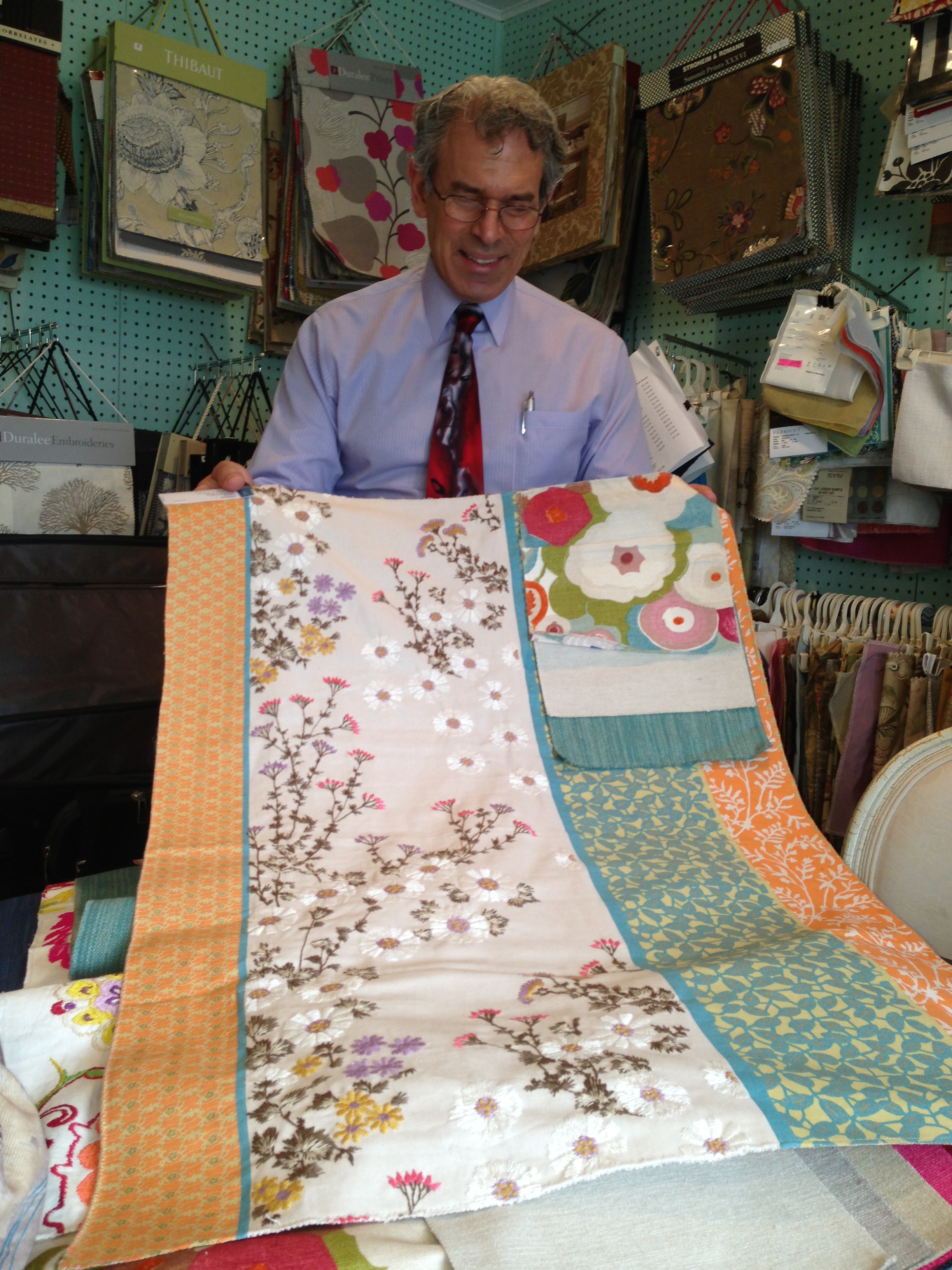
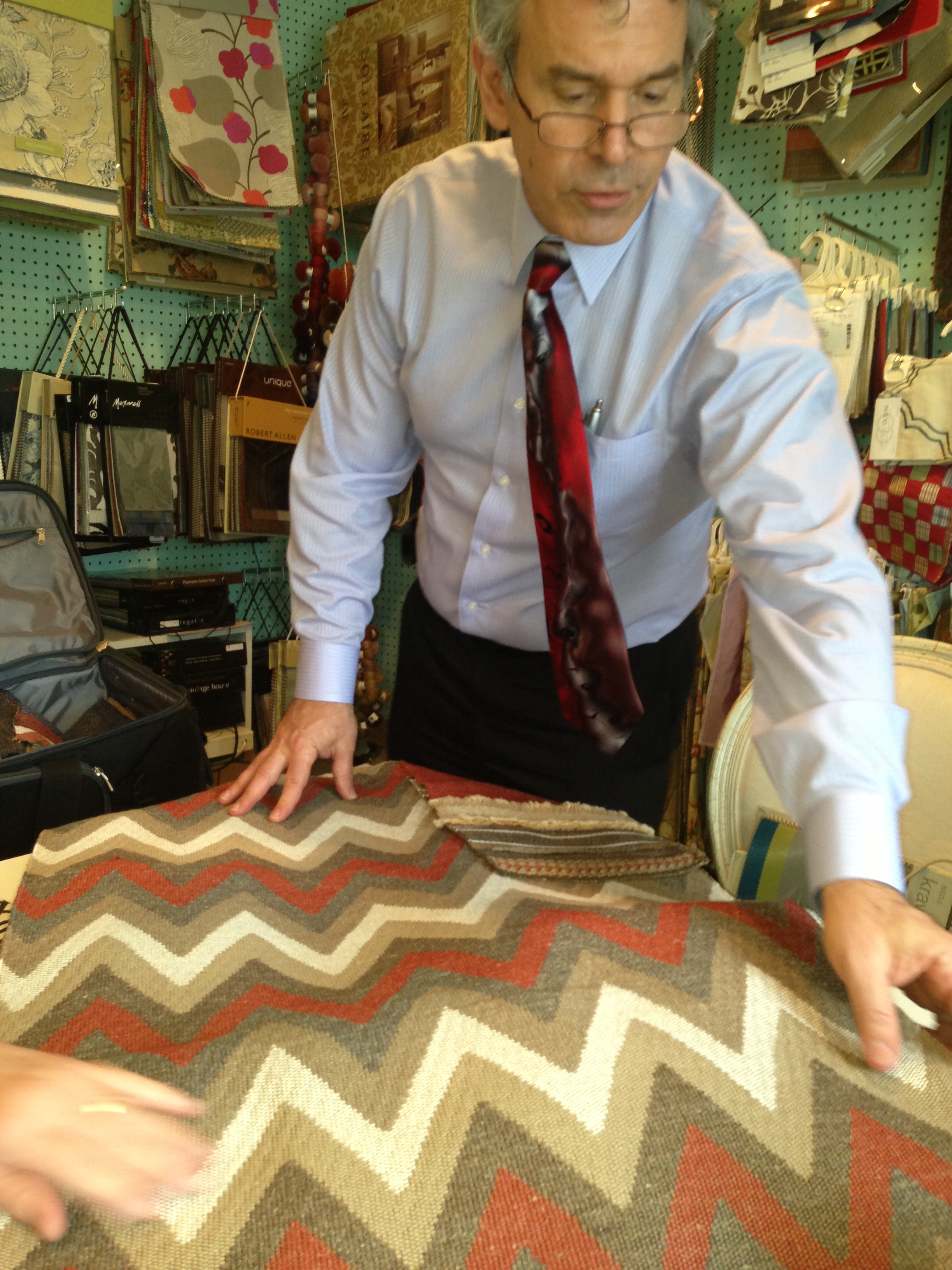
Yesterday was my day at Denise Maurer Interiors. We met with Ted Fall our Kravet consultant, he was excited to talk about some new fabrics, carpets and wall coverings from Kravet, Lee Jofa and Brunschwig & Fils. Here are some highlights from our meeting! Here is Ted Fall holding up one of our favorite fabrics of the day!!!!
Ted Fall Kravet
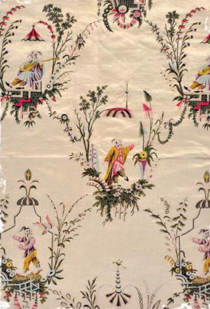
Chinoiserie Le Jardin
Le Jardin Chinois Collection celebrates the fantasy and timelessness of chinoiserie. This as you know from past posts is a design that intrigues me! It takes me to an elegant faraway place and holds my imagination. European trade with China brought about a passion for chinoiserie, a style that captured fantasies of Chinese life ~ephemeral pagodas, long-tailed birds, men in coolie hats, flower laden vines. During the 18th century, French artist Jean Baptiste Pillement combined Chinese themes in a particular and stylish manner which proved to be very popular. Jean Baptiste Pillement was a painter and designer, known for his exquisite and delicate landscapes, but whose importance lies primarily in the engravings done after his drawings, and their influence in spreading the Rococo style and particularly the taste for chinoiserie throughout Europe.
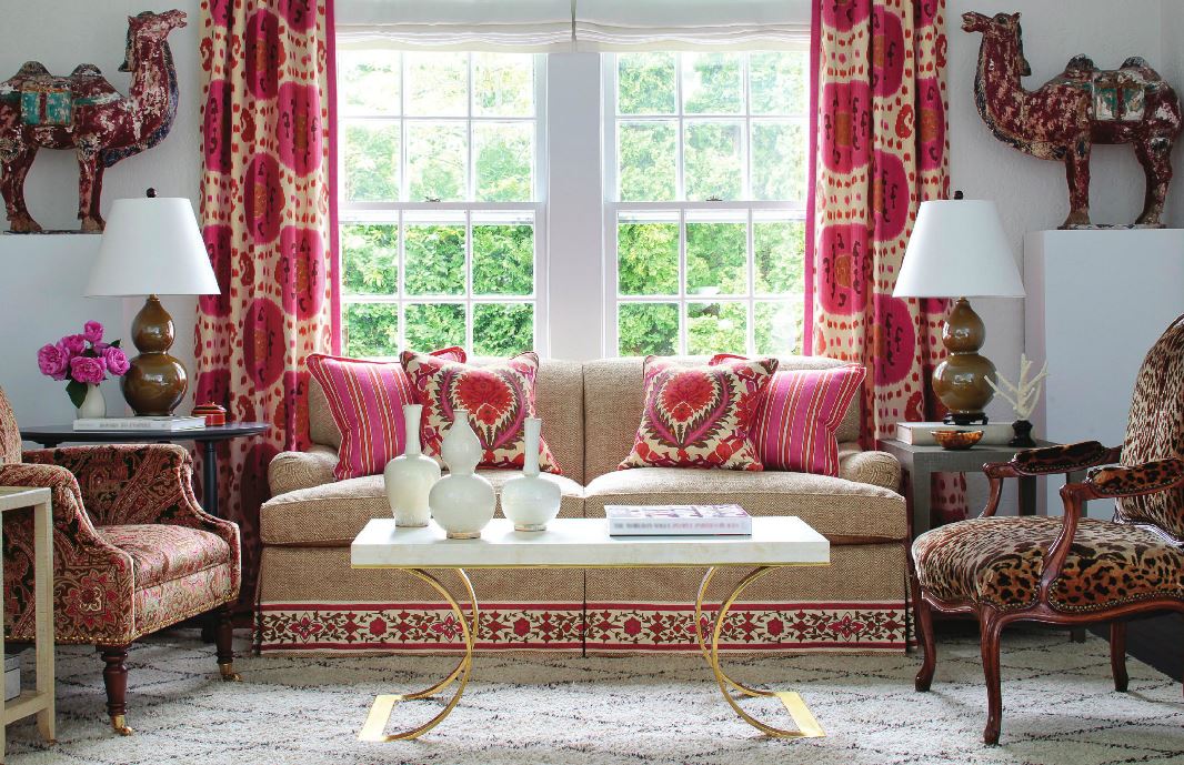
Brunschwig & Fils
In 1941, Brunschwig & Fils founder Roger Brunschwig went off to war and his wife, Zelina, took over the family business. Mrs. B, as she was affectionately called, was a woman of great style, sophistication and inventiveness. Mrs. B is credited with developing the brand and aesthetic of Brunschwig & Fils as we know it today and for introducing scheming into its marketing efforts. Her motto “Good Design Is Forever” still holds true today.
These new collections bring a colorful approach to design with linen embroidery and crewel. Featuring bright colors, bold graphic patterns, geometric, abstract and comtemporay linear patterns that range in both vivid colors and neutrals. We were all inspired by the colorful animal prints, paisley, and Ikat fabrics that are the trend this season!
Some other fabrics Ted Fall shared with us…
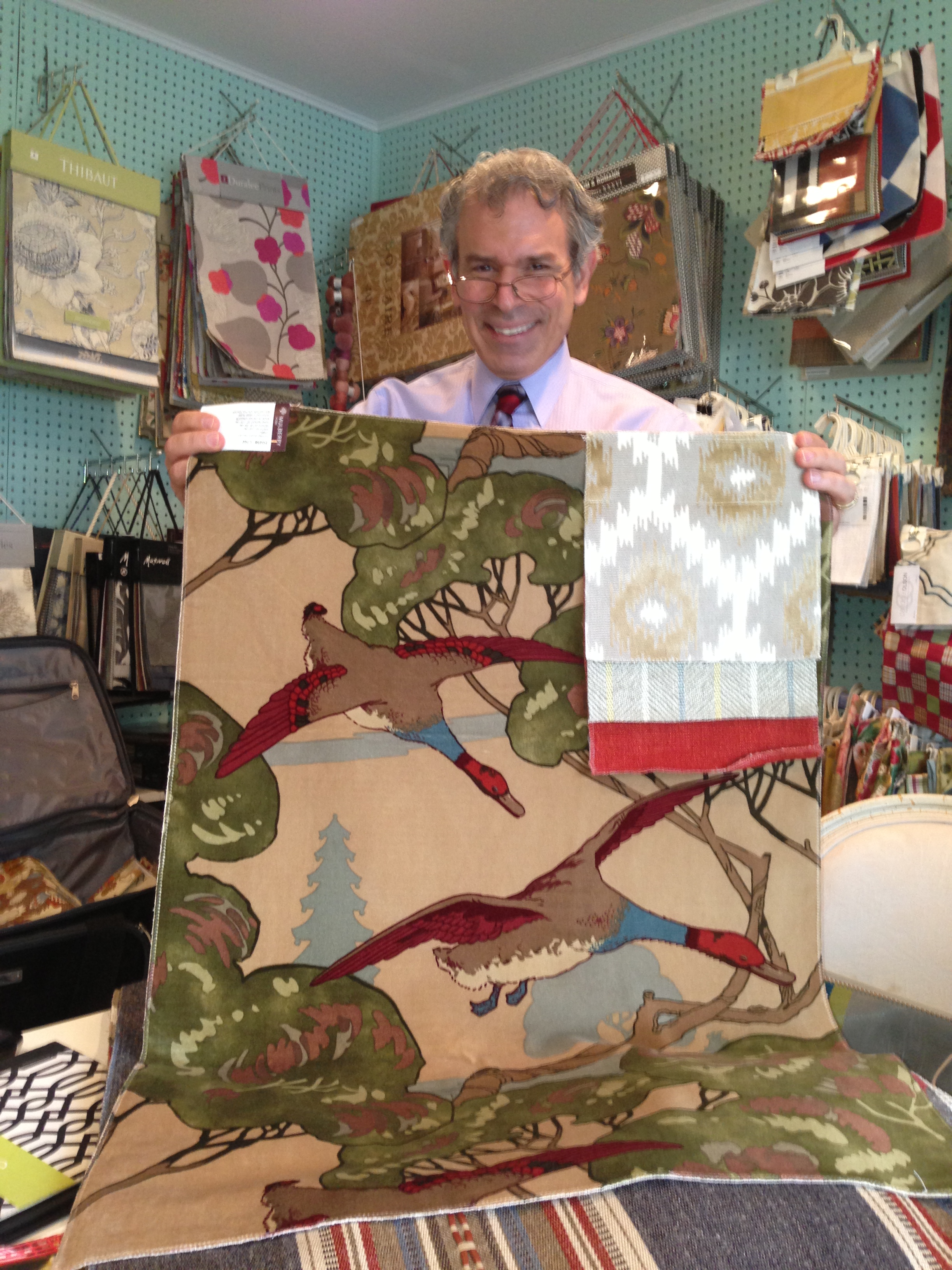
Mulberry Fabric
Johnathan Adler
Here are some Cheveron patterns that again have made a comeback with Johnathan Adler for kravet!
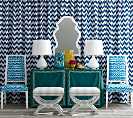
Cheveron earth tones
Thanks to Ted Fall for his time and sharing Kravet, Lee Jofa and Brunschwig & Fils designs in new carpets, wall coverings and fabrics. I’m looking forward to going to New York City May 20-21, 2013 and visiting Blogfest 2013, hope to see you all there!

Blogfest 2013
Blogfest 2013!!!!
Kravet is once again hosting for Interior Design Bloggers a two-day event. Featured designers and design collaborations: Candice Olson, Thom Filicia and Sara Peterson. Also sponsors include Kravet, Lee Jofa, Brunschwig and Fils, Newel (whose showroom I’ve visited on many occasions and actually met Mr. Newel on one of my visits!) New York Spaces, HGTV Interiors, Wilsonart, Kips Bay Decorator Showhouse and ICFF.
Here is some information you’ll need:
This event is: Private
Please click on the widget on my sidebar for a link to the site and register!!
As always stay tuned for more adventures in Styleland!!
XOXO
M


")
")


