Spring is just around the corner, and one of the best ways to celebrate the season of new beginnings is to mix some of today’s fresh new fabrics into home decor. If you’re sad to see prints like the lattice, trellis and chevron start to lose traction, never fear. Many of these designs are still around, but with a twist. And other clean, bold styles are emerging. Below we spotlight some fabric patterns that are back in style. They are “new” in the sense that they are causing a stir this season, but you’ve definitely seen them (or some version of them) before. Check them out!
Ikat
Ikat Fabric designs unite centuries-old modes of craftsmanship with many gorgeously suffused palettes. Ikat literally translates as ‘to bind,’ hinting at the intricate processes involved in its making.
New Ikat Patterns
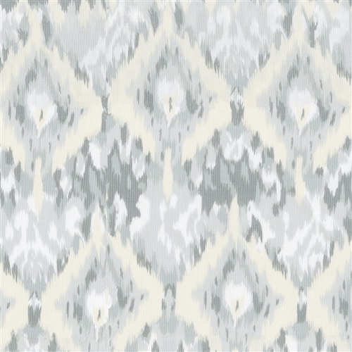
The ikat pattern takes the traditional chevron and gives it a little blur, ikat style. This is such a stylish and current design decor. The soft shades of gray with just a hint of yellow make it a perfect neutral choice. Chevron pulses with youthful energy. Perhaps that’s why it’s so popular with customers in their 20s and 30s. It’s fun to see their faces light up when they walk into stores and see fireball chairs.
If you’re closer to my age, chances are when you see chevrons you are reminded of the flame-stitch patterns that were so popular back in the day. Believe me, today’s chevrons are not like those kooky patterns in your mom’s living room. Done in turquoise, coral and emerald, they look brand-new. I love a chevron mixed in with more traditional fabrics in pillow arrangements, whether on a sofa or bed, to give the overall look more zip.
Ikat Chevron Pattern
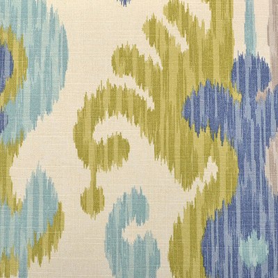
Carole Fabrics
This Carole Fabric has been so popular, the citrine and blue together are exquisite! This fabric would make a great window seat!
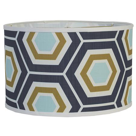
Honeycomb
A honeycomb resurgence has been in the works on for the last few years, but recently designs have shifted away from heavily outlined prints and toward more natural, modern renditions. The Honeycomb Crewel Pillow Cover from West Elm, shown below, features a raised textural surface and an elongated design.
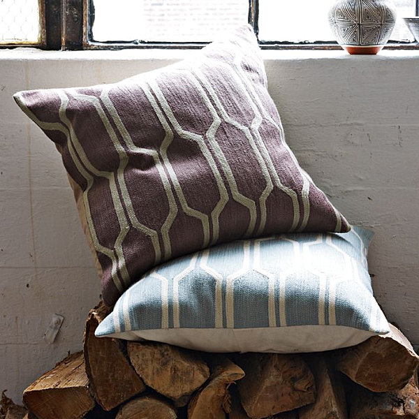
Honeycomb Pattern
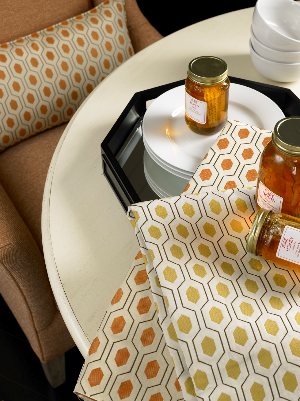
These patterns geometric in design are more classic with a modern twist!
I love not only the honeycomb pattern but the color combination used on this distinctive light shade! Imagine building a room’s colors around this palette. Learn more at Shades of Light
Honeycomb Light Shade
Trellis
The Imperial Trellis pattern is nothing new but it has been making a big statement in interiors lately. I must say, I think I am falling in love!
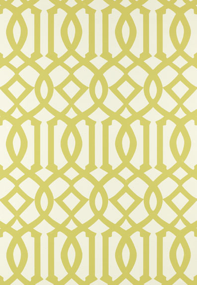
Imperial Trellis Schumacher
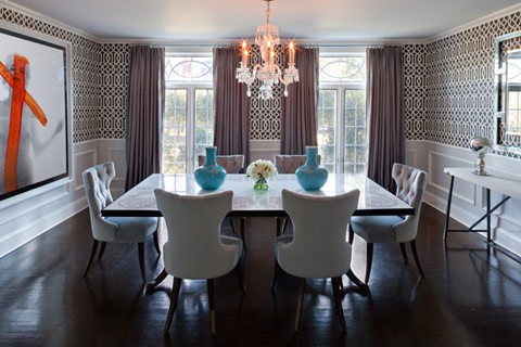
It is everywhere from upholstery, drapery, accessories and even wall paper. I am loving this dining room below. The trellis pattern can be a bit busy as with any pattern, but this design was executed perfectly! It is balanced with the white color palette and simple forms in the space. There are so many traditional elements in this space yet it has a clean modern feel, my favorite!
 Kelly Wearstler’s trellis is one of the most popular here are a few other favorites.
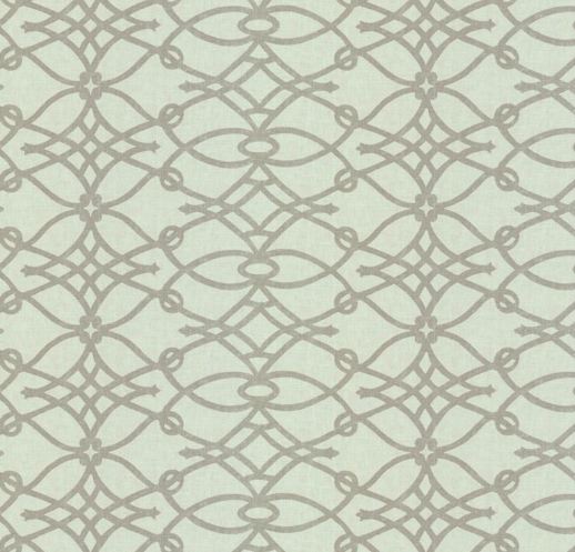
Fioretto Graphite
Dura Lee Covington
This great pattern is a Relaxed Roman on my Etsy Store!
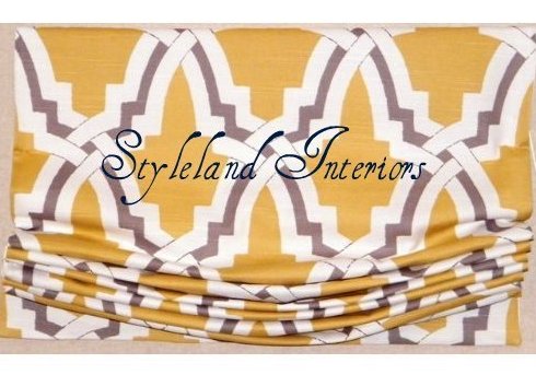
Lattice
I must say that Trellis and Lattice are almost one in the same, but today’s designers have given yesterday’s lattice patterns a modern vibe. Even though the new look in lattice motifs is big and bold, this reinterpreted classic is really pretty quiet, so it works well mixed in with fabrics that are stronger, brighter and busier.
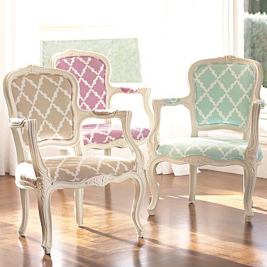
Lattice Chairs
My favorite way to use lattice fabrics right now is on side chairs. They create an interesting backdrop for a host of fun decorative treatments in a room.

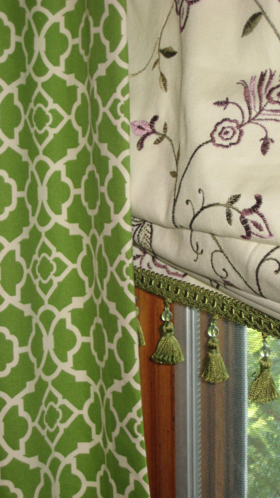
Lattices also are ideal for layering, whether you’re pulling together window treatments or a grouping of accent pillows on a bedding ensemble that is as perky as a cup of morning coffee.
Carole Fabric
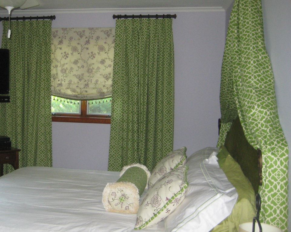
Lattice panels and pillows
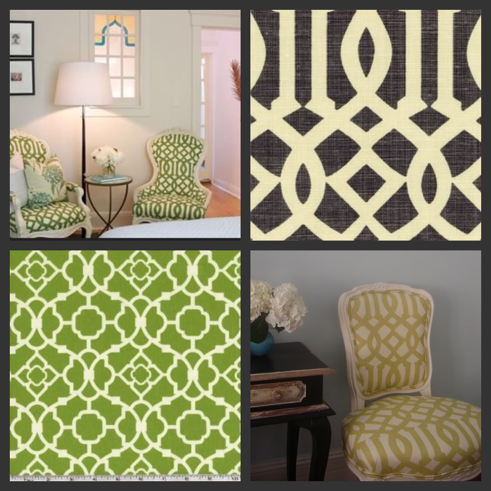
Lattice or Trellis??
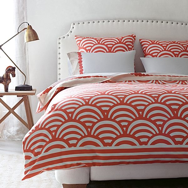
Scales
Sometimes mod, sometimes purely modern, the fish scale pattern can be traced back through a variety of decades, sporting an equal variety of looks. In this decade, the print has re-emerged on pillows, rugs and bedding, such as the Coral Lamu Duvet from Serena & Lily:
Fish Scale Design
The pattern also comes in shades of brown and coral, making a striking statement as bedding, especially when paired with an upholstered headboard. The Chocolate and Coral Fish Scale Euro Shams can be seen in the images that follow. While the pattern is advertised as sporting a bohemian style, the curves of the print can veer into Art Deco territory with the right accessories.

Fish Scale
If you’re a true Hollywood Regency enthusiast who appreciates a clean-lined geometric pattern, you’ll love the Scales Pillows in Citron and Teal, Fabric from Spoon Flower. These Down filled pillows would make a statement in any room!

Spoon Flower Fabric
What do you think of these “new” fabric patterns? It’s nice to change things up, right?! Trends are clearly leaning toward the tribal. If tribal style is a reaction to crisp, clean-lined patterns, then what could be next? Another celebration of defined, outlined prints? Hope you enjoyed this take on patterns…
As always, stay tuned for more Adventures in Styleland!!!
XOXO
M


")
")


