From the moment a designer first starts sketching a new space, she will give thought to the materials you would like to use, and make sure the design is the right fit for you and your home. But what designers really create is pure art and beauty to inspire your home! Recently, I decided to do some research and found some great pictures of Kitchens and Baths that take design to a new level, of course there are a few of my favorites thrown in as well hope you enjoy these:

Shaker style began a rise in popularity in 2009 and gained momentum in 2010. By the end of the year, Shaker has supplanted Contemporary as the second most popular style used by designers, while Traditional remains the most popular style. Cottage was the only other style to garner at least 20% of the market. Dark natural finishes overtook medium natural, glazed, and white-painted finishes to become the most specified type of finish toward the end of 2010.

Chris Novak Berry Brooksberry and Associates
While medium natural cabinet finishes fell from being used, dark natural finishes rose from 42 to 51%. Light natural and colored painted finishes remained fairly common and distressed finishes dropped significantly.
Cabinetry options also changed recently, Wine with everything. While the incorporation of wine refrigerators seems to be on the decline (below), unchilled wine storage is growing in popularity. Other types of cabinetry options are on the decline, including tall pantries, lazy Susans , and pull-out racks. Appliance garages also seem to be falling out of favor, as their use declined from the end of 2009 to 2012.

Four doors, the French door refrigerator has strengthened its position as the type specified most often by designers. While freezer-top refrigerators were always used by designers, as 2010 drew to a close, freezer-bottom models began to gain popularity. Side by side refrigerators have made a good showing, still being used in many designs.

This Kitchen was created by my friend and colleague Denise Maurer of Denise Maurer Interiors, It was featured in June 2012 Country Living Magazine! Love the Soap Stone carved sink with whale motif! The owners are Bonnie and Bill Daggett’s this is their Massachusetts beach house. This is just a little excerpt from the article:


Posted in Designs From Merlin Drive, Uncategorized | Tagged Bath Design, candice olson, Chrystle Chandelier, Clive Christian, Designs by Michele Schenectady NY, french door refridgerator, home design, House Beautiful, housewares, Kitchen Design, Kohler, KraftMaid, lighting, Refridgerator, Showhouse, Traditional Home, Wall ovens, Wood Mode Kitchen Cabinets | Leave a Comment »

I always read CertaPro’s Facebook page, they had a link to this post by Mckenzie Brickl from STIR Magazine, I talked with Mckenzie several years ago when I worked with Sherwin Williams about color and blogging. I thought I would repost this.. a little incite into why we paint our porch ceilings blue so often. Enjoy….
Once just an old Southern tradition, the blue porch ceiling has made its way north and is being introduced to new generations. There are numerous theories as to why — from fooling spiders and wasps into thinking the ceiling is the sky, to blue being a harbinger of good luck, to the color extending daylight, to scaring away evil spirits.
In the Northwest, aurora blue is a popular shade for the porch ceiling. It’s associated with the Aurora Colony, a Christian communal society that gained popularity in the 1850s.
Blue porch ceilings are also quite prevalent along the east coast, from Boston to Philadelphia and other historic cities, where Victorian and Colonial homes abound.
Sky blue ceilings were a popular color scheme for the Victorians, who preferred the colors of nature when painting their homes. Mustard yellow, ochres, browns, olives, terra cotta and the color blue were commonly used in exterior paint schemes. The warm earth tones reminded the Victorians of the outdoors around them, with the blue reserved for the porch ceiling to remind them of the blue sky even when the days were overcast and gray.
The Significance of Haints
Blue ceilings are popular and have been popular in the South for centuries. “Porch ceilings have always been blue in the South,” says Lori Sawaya, an independent Principal Color Strategist. “People continue to paint their porch ceiling blue because that’s what their grandmother did, and that’s what her grandmother did.”
But many Southerners suggest that blue porch ceilings originated out of the fear of haints. Southerners, especially in the area of South Carolina, have a name for the ceiling paint used on porches — the soft blue-green is referred to as “Haint Blue.”
“Haints are restless spirits of the dead who, for whatever reason, have not moved on from their physical world,” says Sawaya.
Haint blue, which can also be found on door and window frames as well as porch ceilings, is intended to protect the homeowner from being “taken” or influenced by haints. It is said to protect the house and the occupants of the house from evil.
Blue Paint as Insect Repellent?
Some people swear that blue paint repels insects, leaving a porch bug-free and pleasant during those long summer evenings and afternoons. Most credible sources discredit this belief. However, this belief could be seated in historical truths.
When blue paints were first used on ceilings, they were usually milk paints, and those paints often had lye mixed into the composition. Lye is a known insect repellent, which would explain why insects would avoid nesting on a painted porch ceiling or ledge. As milk paint has a tendency to fade over time, giving it a rustic look, people would usually need to repaint their home every year or few years, covering the existing coat with a new coat of paint, and fresh lye.
But many still theorize that insects prefer not to nest on blue ceilings because they are “fooled” into thinking the blue paint is actually the sky.
Extending Daylight Hours
Haints and insects aside, many people choose to paint the porch ceiling blue simply because of the way it makes the room look and feel. Blue is a calming color, so using it to paint an area of the house that’s intended for relaxation makes sense. Throughout the U.S., porches are often a favorite place while the weather is warm, or even hot, to sit and watch time and life go by. When sitting on the porch, it can seem as though life has taken on a slower pace, as though relaxation is a must.
People may also paint the porch ceiling blue because the color seems to emulate the natural sky and makes the daylight hours feel as though they last just a little longer. “Light blues especially lighten and brighten space and propagate any light that you do get, because of the basic nature of color,” says Sawaya.
Picking the Right Blue
Most paint experts agree that the best shade of blue is the one that fits the look of the house. “You don’t want [a blue ceiling] to look like an afterthought or like it came out of nowhere,” cautions Zoe Kyriacos, architectural color consultant for Colors by Zoe in Takoma Park, Md. “You want to make it look like it was part of the package.”
She says blue can be used on any style of house; it just depends on the blue. “A traditional house would use a more traditional color, something lighter. On a contemporary house you can do something bolder, something brighter.” Kyriacos prefers blues with hints of other colors, which make the blue more complex and interesting, she says. A blue with a drop of red in it, for instance, adds “a little warmth.”
Hope you have enjoyed this post, I know I did. In Feng Shui blue is a water color represents the healing waters and the clear sky, it belongs to the water Element. I have long recommended blue doors for a home, so whomever enters will have a calm feeling. Blue should be used in the feng shui bagua areas in the East ( health & family) and Southwest (wealth & abundance) of your home, as water energy nourishes the wood element of these feng shui areas. That’s just my input on the color blue…. What’s yours???????????
As always, stay tuned…..
XOXO
M
Posted in Designs From Merlin Drive | Tagged Ceiliing colors, decorating, Feng Shui, home decor, Paint Colors, Porch colors, Sherwin Williams | 1 Comment »
 One of my favorite designers, Miles Redd was raised in Atlanta, moved to NYC to study film, but was more interested in design. He worked with another of my favorites Bunny Williams, this month he is featured in Veranda Magazine, This house in Hudson NY, near to Albany NY where I’m located. I would love to see this home!!! Veranda looks at the Master bath, this is the dining area, in the home.

also featured in 2010 Veranda, he favors chinoiserie wallpaper and the color turquoise! Here is the House of Turquoise!

Winner House of Turquoise!!!
Redd is currently the creative director of Oscar de la Renta Home and continues to wow the design world with his luxurious, one of a kind interiors!

 Courtesy of Elle Decor!!


 This man is a color genius!! This home opulence at its finest. Just inspire me!!!!! Loving this profession, nothing like these talented people to help give you vision and clarity about how to create beauty. One more for the road, de Gourney custom wallpaper, fabulous………..
 As always stay tuned……….
Posted in Designs From Merlin Drive | Tagged Bunny Williams, canopy bed, chinoiserie wallpaper, decorative painting, Designs By Michele, East Greenbush NY, Elle Decor, home decor, Home Decorator Albany NY, house of turquoise, http://local.timesunion.com/, Interior Decorator Albany NY, Interior Design and Decorating Loundonville, Interior Design and Decorating Services Albany NY, Interior Design and Decorating Services East Greenbush NY, Interior Design and Decorating Services Saratoga Springs NY, Interior Design East Greenbush Ny, Interior Design Saratoga Springs NY, Interior Design Schenectady NY, Interior Design Service, Interior Design Service Albany NY, Interior Design Service Saratoga Springs NY, Interior Designer Albany NY, Miles Redd, NY, Saratoga Interior Design Service, Veranda Magazine | 1 Comment »
My desire for beautiful things led me to the wonderful world of custom window treatments. These windows could not be created through JC Penny’s (not to diminish the great treatments they sell but…) finding all the beautiful window treatments we see in magazines, made me think… you must know that designers create them, right??. Our vision along with the talented women and men who run our workrooms. They can take the idea that we draw on a piece of paper along with the fabric that we send to them and make our thoughts a reality. There is nothing as beautiful as a custom window treatment! I hope you enjoy my long love-affair with fabrics, fringe, draperies, tassels and all things to do with improving your view………. There are just so many talented people out there designing, creating, sewing, building, and making the world a more beautiful place… Just to share some of the fabulous Window Treatments I have come across lately. As you all know I love Roman Shades but the elegance of these draperies makes me long for more formal spaces…

Smocked Header so feminine and lovely…..

Barry Dixon Decorator magazine

Sue Ellen Gregory Design
I just love this room by designer Sue Ellen Gregory, love the bench! tea anyone? Here’s a rod-pocket done well, and I love the way they’re mounted on the hold backs… Wow that’s just talent!!!

Judy King

Love this whole room!!!! What beautiful windows!!
Swept back silk with those cute little london’s in the bay (this is opera’s Renee’ Flemings’ home) window by Jamie Gibbs Assoc.
 OMG!!!!! These are the one of the most creative!!!! Inverted pleat with bows!!!!!!!!!!! They just make you smile :-) Susan Schurz.
 With Rods and Rings taking Center stage this box pleat heading is so popular right now!!

Jan Cote
This is luxury, love the leading edge on the panels! Great Bench!!!!

Christina Azario, so I’ll end here with the luxurious Panels and of course ROMAN SHADES!!!! My favorite…. Hope you’ve had a good time I know I did..
As Always, stay tuned…..
XOXO
M
Posted in Designs From Merlin Drive | Tagged Beautiful Window Treatments, Box pleat panels, curtain panels, Curtains, Custom Window Treatments, Designer Window Treatments, Designs by Michele Schenectady NY, home decor, Michele Conti, Panels, Roman Shades, Showhouse, Veranda Magazine | Leave a Comment »
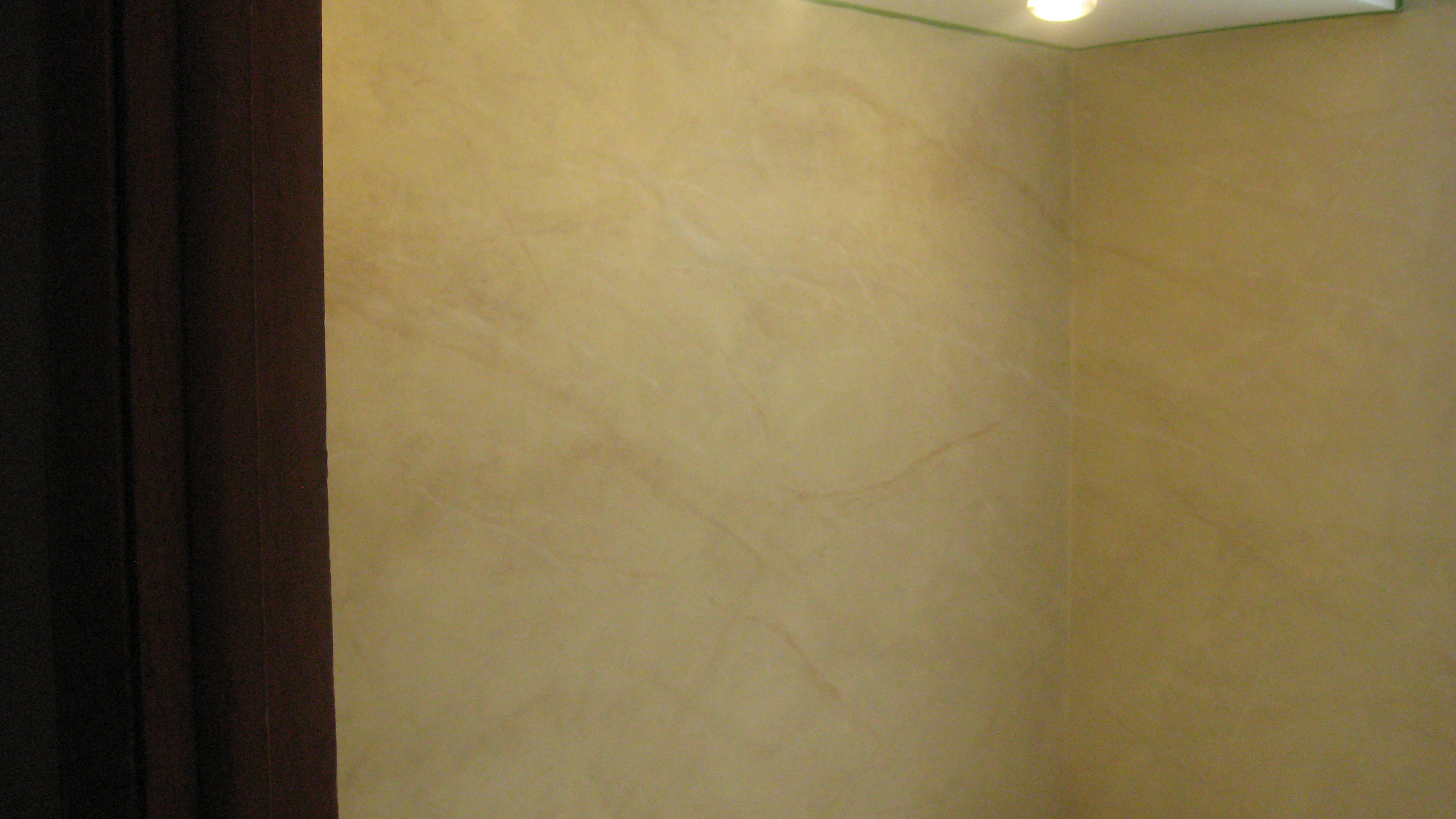
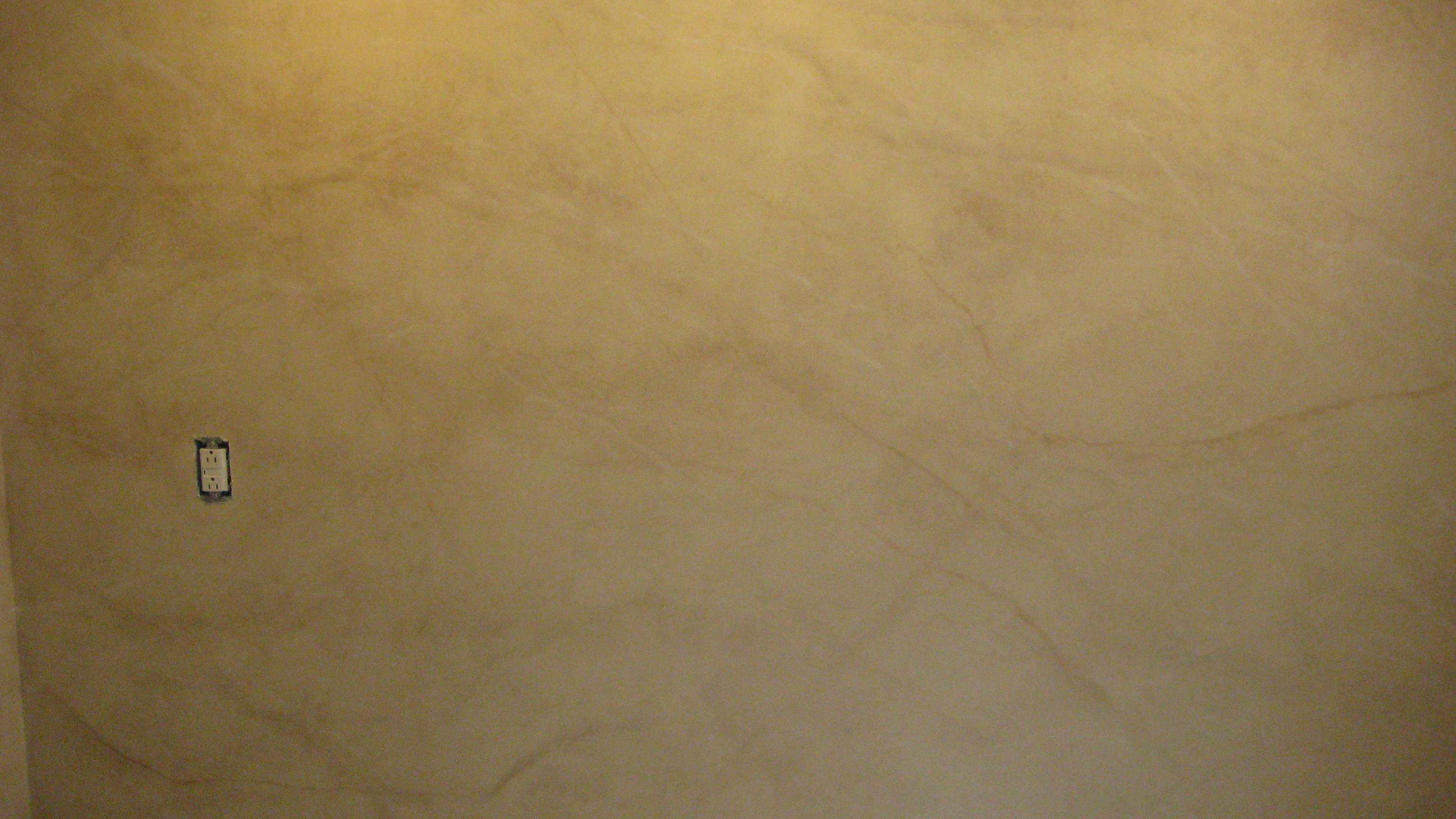
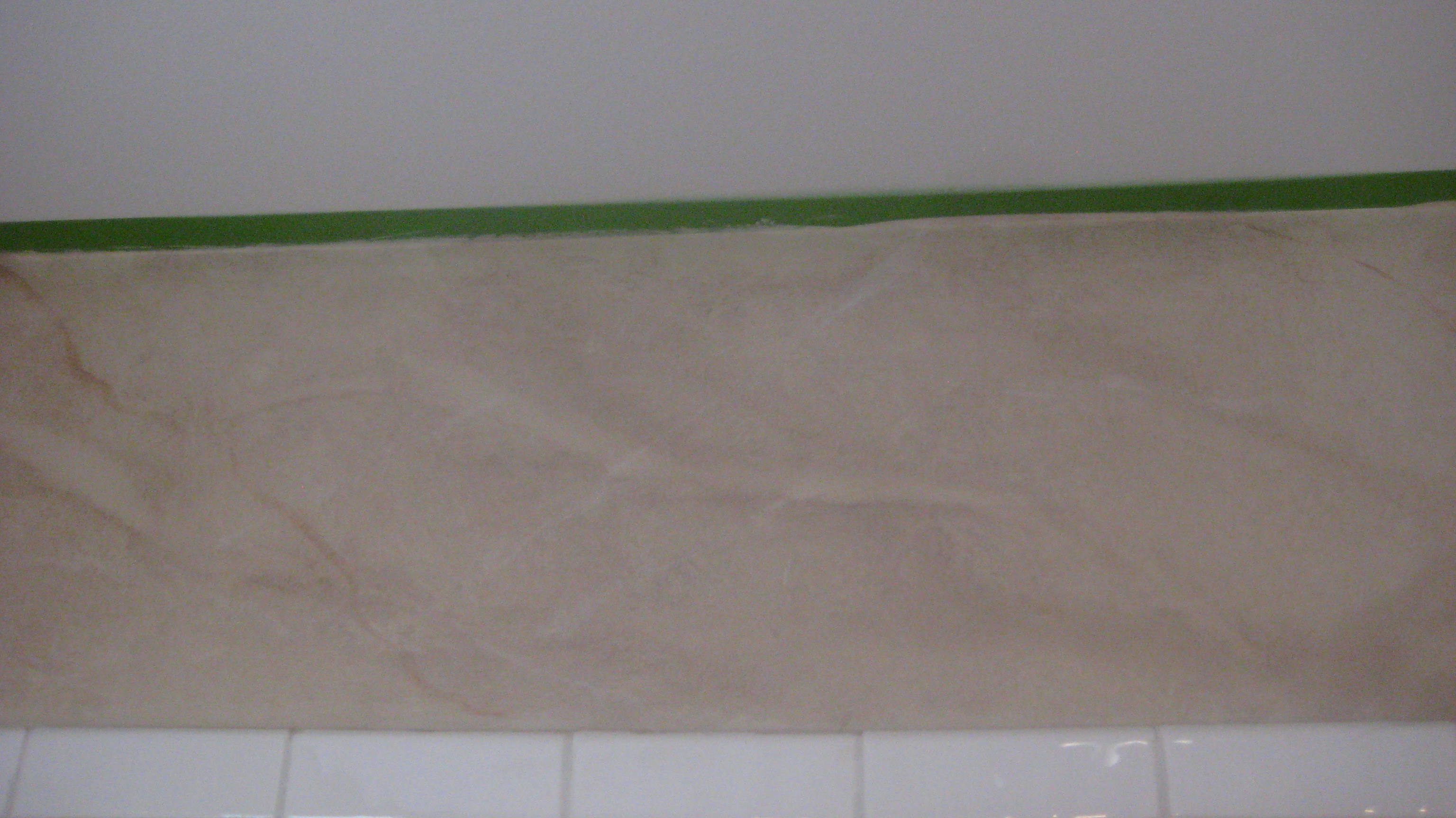
Thank you to Tania for letting me create a Marble Spa in your Bathroom, Just a quick post!!! More pic’s to come of some on going work I am doing!!!! Life is good, Girls are great, Mother Theresa Coming to oversee Father’s Day Feast tomorrow!!!

As always stay tuned!!!
XOXO
M
Posted in Designs From Merlin Drive, Uncategorized | Tagged Albany NY, Beautiful homes bedding bedrooms Bellini candice olson Certapro Painters curtain panels Curtains decks decorating decorative painting design Dining Rooms family fashion Faux Effects grey colors grey t, decorative painting, Designs by Michele Schenectady NY, East Greenbush NY, Faux Effects, faux painting, Home Interior Design Albany NY, marble finish, NY, Saratoga Springs NY, Schenectady | Leave a Comment »
Good Morning and let’s welcome another week of frolicking and summer fun. I can’t believe its June already!!! Summer is here and life is in full swing!! Some great design ideas for Summer entertaining! We’ll start with Bellini’s my favorite! I love serving cocktails on the deck on a great summer day!

Kiwi-Strawberry Bellini Makes: 8 servings
4 Kiwi
16 Strawberries
1 (750ml) bottle Prosecco
Remove skin from kiwi fruits, cut into quarters. In a food processor or blender, puree until smooth. Remove stems from strawberries, cut in halves. In a food processor or blender, puree until smooth. Spoon kiwi puree and strawberry puree onto the bottom of champagne glasses, about 1 to 2 heaping tablespoons each. Pour over fruit puree and enjoy.
*Note: you can substitute Prosecco with sparkling white grape juice for a non-alcohol version.

Summer is here at last and so is lingering in summer spaces. The photography that Horst shot for Vogue and House & Garden in the 1960s, 70s and 80s has such enduring appeal. Right now, I’m drawn to spaces with summer-style. I hope you are finding time to linger in summer spaces, too.

Here is a view of Schoon Lake in New York. On this beautiful site Eagle Capital Group is building a Spa and Resort, to be named”StoneLedge”. Myself and Maurer Interiors will be helping with the interior design of this project. We were so excited to share this vision with him. What a slice of heaven!!
Just a few outdoor spaces to end today!!


 As always stay tuned….
XOXO
M
Posted in Designs From Merlin Drive | Tagged Bellini, designer rooms, Interior Design, outdoor space, Schroon Lake, summer cocktails, Summer style, Summertime fun | Leave a Comment »

Prom Princess 2012
The day had arrived, in the morning our little princess Giovanna slept in. This was going to be a day to remember, she was already well into her time as a young lady but, today she would morph into a graceful and elegant princess. We had been anticipating this day with great joy. I had attended all of the parent information meetings and been informed of all the dangers, read all the blogs, paid all the expenses. This is how Giovanna’s day went… She planned everything from her dress, (even with some alteration issues), shoes, jewelry, nails, toes, limo, hair and makeup, all set to go. The excitement and joy of the occasion was in her heart, and she was ready to start her day! A light breakfast and Shower and the Day had finally began!
We had Amanda (the owner of Switch Salon) with her makeup artist, come to the house at one o’clock. Giovanna was able to get ready, stress free in her home with three of her good friends. No extra charge from the salon, only requirement was to have at least 4 girls participate, and our family could be here to celebrate and watch the transformation take place , we also would not be rushing from place to place it really cut down on stress. Nails and Toes were done earlier to avoid pressure the day of the prom.
Mother Theresa, Cousin Stefanie, Aunt Carol and Uncle Lou, (who owns Soto Studios, how great to have a photographer in the family!) were at our home for this auspicious occasion. Pictures started at 4:30, She was a vision to her Dad and I. We could not be any more proud of the beautiful person she has grown into.
The Limo was to arrive at 5:00 at Mr. & Mrs Litz’s home, (More Photo’s!!!!) and the evening began…… the Prom Walk at her school, than off to the Marriott for the Prom, fun and dinner then dancing. But the night didn’t end their in our school district the young men and women are invited to an after prom. The venue was a historic theater in Schenectady NY, Proctor’s!! They had a hypnotist and more food and fun!! Here are Giovanna’s friends that were with her for the day and the handsome young man who escorted our young lady! Enjoy!!!

Almost Ready!!


Thank you to all who made this night a great success!!
As always stay tuned…..
XOXO
M
Posted in Mother Theresa, Uncategorized | Tagged home | 1 Comment »
I was at Denise Maurer Interiors on Wednesday and a colleague, Besty Mattice was doing an interview on ceilings for a local paper. She came into the office where we were sitting and said “What is the color of the Year?”, Denise says “Tangerine!” and I thought okay, lets talk about the color of the year Pantone says its called Tango Tangerine.

Exotic and Sultry Tango Tangerine is Color of the Year
“Sophisticated but at the same time dramatic and seductive, Tangerine Tango is an orange with a lot of depth to it,” said Leatrice Eiseman, executive director of the Pantone Color Institute®. “Reminiscent of the radiant shadings of a sunset, Tangerine Tango marries the vivaciousness and adrenaline rush of red with the friendliness and warmth of yellow, to form a high-visibility, magnetic hue that emanates heat and energy.”
Jackie Jordan who is Sherwin Williams color expert always puts together a 2012 palette although her forecast seems to always be inspired by “Mother Earth” this is what she said this year about Reds “You were the first pigments we brushed on the cave wall, ground from the earth, an ancient hand print, a hunter’s arrow still chasing its target. You precede the words we’re left with to describe you: aboriginal, neolithic, blood and fire, danger and victory. You’re our past made suddenly present and the warm heat of the transformation: the V on a Masai warrior’s chest, the kiss left by a Hollywood starlet. We’ll never solve your eternal mystery: how the easiest pigment to make remains the hardest to forget, from the images our young eyes first imagined flickering in the firelight to the walls that now warm this room.” In her pallet of Reds, she lists a color named “Daredevil” sw 6882, this spirited orangey Red is a high impact hue that would energize and add spice to any room.

This color manages to fuse happy-go-lucky warmth with sultry exoticism!( Pillow fabric, Trina Turk Santorini Persimmon $96.00 Per yd)

Dura Lee Fabric Walton Collection book # 2765
Pattern/Color: 20994-107, TERRACOTTA
I would like to say, this great color can quickly get out of control, I would tread lightly at first. Start small, this color has a lot of energy, pair it with neutrals like grey’s and taupe’s, add in some great patterns!
I love this color in Fashion also, this rich color goes on anything! Loved the OPI nail color as well as the lip colors that are out this year, spring is a great time to pop some color into your wardrobe! A little inspiration for you….

Celebrity Fashion in this energetic bright!!

My Cousin Donna always says ” Accessorize, your outfit is never complete without it”
This group of accessories really shows all the options for this color, Love the chunky bracelet and earings!

This room was done by a client of mine and the shade is a flat roman I sold to her on Etsy!!
So there is our color choice for 2012, Pantone’s official color for 2012, “Tango Tangerine,” is a much brighter and more cheerful shade of orange than last year’s reigning “Honeysuckle,” but its coronation confirms that the vibrant hue—already a cosmetics mainstay—has been fully embraced throughout the worlds of fashion and design. Stimulating to the senses and considered to have an uplifting effect, tangerine is also highly valued for its invigorating scent. And in terms of color cosmetics, it is more flattering on a larger variety of skin-tones and also serves as a great transitional shade from the vibrant reds or pinks that have been so popular recently.
As always stay tuned…..
XOXO
M
Posted in Designs From Merlin Drive, Uncategorized | Tagged Designs by Michele Schenectady NY, East Greenbush NY, fashion, hollywood starlet, Interior Decorating Saratoga Springs NY, Interior Decorator Albany NY, Interior Decorator Schenectady NY, Interior Design Service, pantone color institute, style, sultry tango, tangerine tango | Leave a Comment »
Spring and summer are great times to do outdoor entertaining, some of our best memories have happened right in our own back yard. I absolutely adore outdoor rooms—-and I do mean rooms—-rugs, lamps, accessories, plenty of magazines–the works. Of course, it helps if you have a roof or awning over the area. We don’t have a covered deck at our house in New York, so when we are having friends over, I place the lamps, flowers and accessories out that day and bring them in the next, I also have a EZ UP canopy that covers the upper level of my deck so if the weather looks suspect we have a place to gather despite some droplets of rain. Look at some of these exquisite outdoor spaces….

Summer living!!!
This is a great space to enjoy your morning coffee, read the paper or gather with your family and friends! The space is tied together with a great rug!! I think spaces that don’t have rugs somehow feel incomplete. Rugs seem to ground the space and give it cohesiveness. This collection of accessories makes me want to curl up in this picture! What a cozy ensemble!

The animal print rug is an eye catching addition to this space, it brings this all together!

Accessories, pillows in pops of green make this sitting area warm and inviting.

Pops of Pink are so inviting in this roof top outdoor room.
With all the bright colors it really pulls this space together.

Great Times with Family and Friends, at my home!
This was my deck, on the 4th of July, with my friends and family these are the best times of our lives!!! Enjoy the outdoors, create a space on your deck or veranda this year that will bring you outside whenever you have a moment!
As Always stay tuned……..
M
Posted in Designs From Merlin Drive, Uncategorized | Tagged ez up canopy, morning coffee, nature, outdoor decorating, outdoor design, outdoor entertaining, outdoor furniture, outdoor living, outdoor rooms, outdoors, plants, rattan | Leave a Comment »
Houzz Home Design
What’s Happening in Styleland!

Adventures in Design
-
Join 495 other subscribers
Home Design
Categories
-
Recent Posts
Follow Me On Facebook! See my Etsy store, and Follow me on Twitter
Blogs I Follow
