Feeds:
Posts
Comments

Posts Tagged ‘home decor’

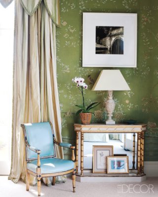
Transitional and modern decor has been so appealing to me because, this decor has the ability to generate a stunning energy that’s all its own. Transitional style can range from influences as varied as country, Asian, Cosmopolitan-formal, industrial and retro. My college Denise Maurer has influenced my attitude toward this style of decorating, this is her mantra, her designs are always clean and crisp, and pulling every look together is one overriding theme: the liberating quality of open airy spaces, allowing fresh style to be on full view.

A large round mirror suspended low like a rising sun, the use of pattern to conjour up a decadent design, grey tones turning fabrics into something sensuous. Without question these rooms are sleek and light filled, the feel is gloriously spacious.

urban country

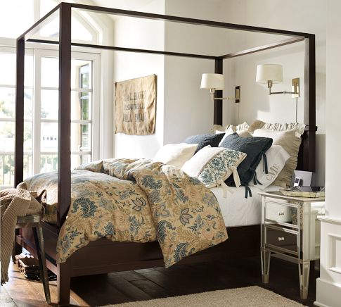
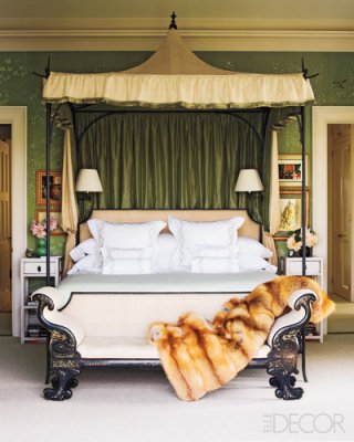
The tall, strong lines of this Shaker inspired bed take on drama in dark expresso wood and the addition of the canopy rails brings balance to the bed and the room, The mirrored nightstand is a contemporary counterpoint to the Shaker-style bed bridging that transition. Framed by the bed, the swing arm sconces become a focal point in this room.

Cosmopolitan View

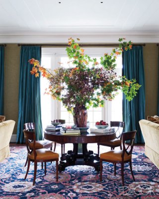
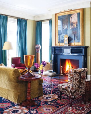
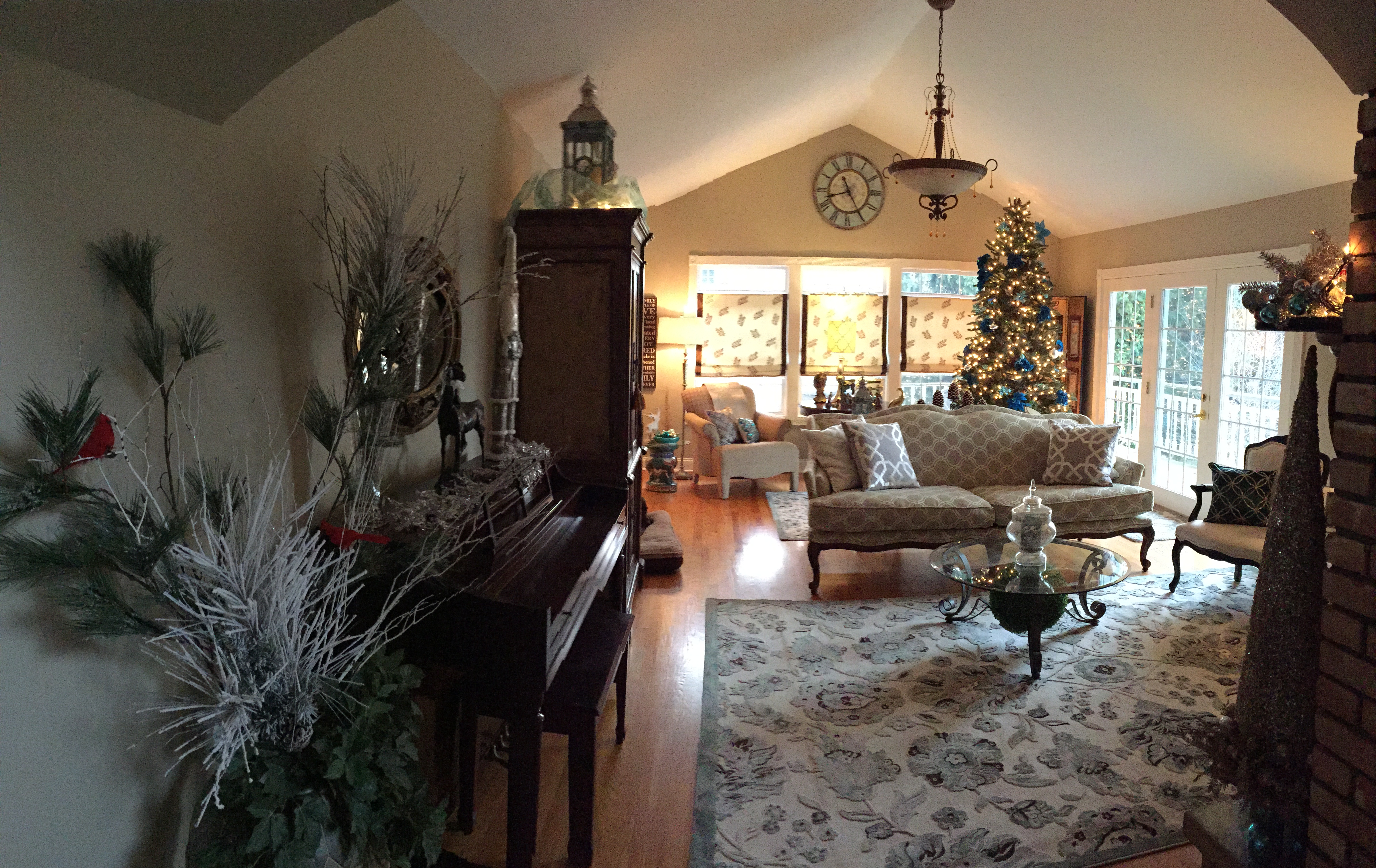
Delightfully sophisticated that’s the view,  start to finish. This look speaks to anyone who takes pleasure in being enveloped in a tailored, formal glamour. The geometric mirrors mingling with transitional contemporary  pieces make this space urbane, cosmopolitan, contemporary and exciting. Pairing formal and contemporary pieces is the start to this glamorous look,  mirrors add glitz, the art deco inspired chairs mixing with the neoclassical curvaceous lines in the fireplace layer this room and put it simply, over the top.

This is definitely a different turn in design for me, but one I embrace whole heartedly. I have always immersed myself in eclectic furnishings and design, but I seem to be stream lining my own taste to a more casual but elegant style. Now if I can just find the time to transform my home to where my heart already resides, I will achieve my own goal of a stylishly elegant yet comfortable home.

As always stay tuned for more Adventures in Style Land!!

XOXO

M

Read Full Post »

Read Full Post »

I always read CertaPro’s Facebook page, they had a link to this post by Mckenzie Brickl from STIR Magazine, I talked with Mckenzie several years ago when I worked with Sherwin Williams about color and blogging. I thought I would repost this.. a little incite into why we paint our porch ceilings blue so often. Enjoy….

Once just an old Southern tradition, the blue porch ceiling has made its way north and is being introduced to new generations. There are numerous theories as to why — from fooling spiders and wasps into thinking the ceiling is the sky, to blue being a harbinger of good luck, to the color extending daylight, to scaring away evil spirits.

In the Northwest, aurora blue is a popular shade for the porch ceiling. It’s associated with the Aurora Colony, a Christian communal society that gained popularity in the 1850s.

Blue porch ceilings are also quite prevalent along the east coast, from Boston to Philadelphia and other historic cities, where Victorian and Colonial homes abound.

Sky blue ceilings were a popular color scheme for the Victorians, who preferred the colors of nature when painting their homes. Mustard yellow, ochres, browns, olives, terra cotta and the color blue were commonly used in exterior paint schemes. The warm earth tones reminded the Victorians of the outdoors around them, with the blue reserved for the porch ceiling to remind them of the blue sky even when the days were overcast and gray.

The Significance of Haints

Blue ceilings are popular and have been popular in the South for centuries. “Porch ceilings have always been blue in the South,” says  Lori Sawaya, an independent Principal Color Strategist. “People continue to paint their porch ceiling blue because that’s what their grandmother did, and that’s what her grandmother did.”

But many Southerners suggest that blue porch ceilings originated out of the fear of haints. Southerners, especially in the area of South Carolina, have a name for the ceiling paint used on porches — the soft blue-green is referred to as “Haint Blue.”

“Haints are restless spirits of the dead who, for whatever reason, have not moved on from their physical world,” says Sawaya.

Haint blue, which can also be found on door and window frames as well as porch ceilings, is intended to protect the homeowner from being “taken” or influenced by haints. It is said to protect the house and the occupants of the house from evil.

Blue Paint as Insect Repellent?

Some people swear that blue paint repels insects, leaving a porch bug-free and pleasant during those long summer evenings and afternoons. Most credible sources discredit this belief. However, this belief could be seated in historical truths.

When blue paints were first used on ceilings, they were usually milk paints, and those paints often had lye mixed into the composition. Lye is a known insect repellent, which would explain why insects would avoid nesting on a painted porch ceiling or ledge. As milk paint has a tendency to fade over time, giving it a rustic look, people would usually need to repaint their home every year or few years, covering the existing coat with a new coat of paint, and fresh lye.

But many still theorize that insects prefer not to nest on blue ceilings because they are “fooled” into thinking the blue paint is actually the sky.

Extending Daylight Hours

Haints and insects aside, many people choose to paint the porch ceiling blue simply because of the way it makes the room look and feel. Blue is a calming color, so using it to paint an area of the house that’s intended for relaxation makes sense. Throughout the U.S., porches are often a favorite place while the weather is warm, or even hot, to sit and watch time and life go by. When sitting on the porch, it can seem as though life has taken on a slower pace, as though relaxation is a must.

People may also paint the porch ceiling blue because the color seems to emulate the natural sky and makes the daylight hours feel as though they last just a little longer. “Light blues especially lighten and brighten space and propagate any light that you do get, because of the basic nature of color,” says Sawaya.

Picking the Right Blue

Most paint experts agree that the best shade of blue is the one that fits the look of the house. “You don’t want [a blue ceiling] to look like an afterthought or like it came out of nowhere,” cautions Zoe Kyriacos, architectural color consultant for Colors by Zoe in Takoma Park, Md. “You want to make it look like it was part of the package.”

She says blue can be used on any style of house; it just depends on the blue. “A traditional house would use a more traditional color, something lighter. On a contemporary house you can do something bolder, something brighter.” Kyriacos prefers blues with hints of other colors, which make the blue more complex and interesting, she says. A blue with a drop of red in it, for instance, adds “a little warmth.”

Hope you have enjoyed this post, I know I did. In Feng Shui blue is a water color represents the healing waters and the clear sky, it belongs to the water Element. I have long recommended blue doors for a home, so whomever enters will have a calm feeling. Blue should be used in the feng shui bagua areas in the East ( health & family) and Southwest (wealth & abundance) of your home, as water energy nourishes the wood element of these feng shui areas.  That’s just my input on the color blue…. What’s yours???????????

As always, stay tuned…..

XOXO

M

Read Full Post »

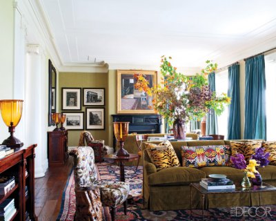
One of my favorite designers, Miles Redd was raised in Atlanta, moved to NYC to study film, but was more interested in design. He worked with another of my favorites Bunny Williams,  this month he is featured in Veranda Magazine, This house in Hudson NY, near to Albany NY where I’m located.  I would love to see this home!!! Veranda looks at the Master bath, this is the dining area, in the home.

also featured in 2010 Veranda, he favors chinoiserie wallpaper and the color turquoise! Here is the House of Turquoise!


Winner House of Turquoise!!!


Redd is currently the creative director of Oscar de la Renta Home and continues to wow the design world with his luxurious, one of a kind interiors!

below, his mirrored master bath ~ photos by Jeffrey Hirsch for New York Social Diary
Here are a few photos from the home in Hudson NY,  you will see why he is one of my favorites…
Courtesy of Elle Decor!!
This man is a color genius!! This home opulence at its finest.  Just inspire me!!!!!  Loving this profession, nothing like these talented people to help give you vision and clarity about how to create beauty. One more for the road, de Gourney custom wallpaper, fabulous………..
As always stay tuned……….
XOXO
M

Read Full Post »

My desire for beautiful things led me to the wonderful world of custom window treatments. These windows could not be created through JC Penny’s (not to diminish the great treatments they sell but…) finding all the beautiful window treatments we see in magazines, made me think… you must know that designers create them, right??. Our vision along with the talented women and men who run our workrooms. They can take the idea that we draw on a piece of paper along with the fabric that we send to them and make our thoughts a reality. There is nothing as beautiful as a custom window treatment!  I hope you enjoy my long love-affair with fabrics, fringe, draperies, tassels and all things to do with improving your view………. There are just so many talented people out there designing, creating, sewing, building, and making the world a more beautiful place… Just to share some of the fabulous Window Treatments I have come across lately. As you all know I love Roman Shades but the elegance of these draperies makes me long for more formal spaces…

Smocked Header so feminine and lovely…..

Barry Dixon Decorator magazine

Sue Ellen Gregory Design

I just love this room by designer Sue Ellen Gregory, love the bench! tea anyone? Here’s a rod-pocket done well, and I love the way they’re mounted on the hold backs… Wow that’s just talent!!!

Judy King

Love this whole room!!!! What beautiful windows!!

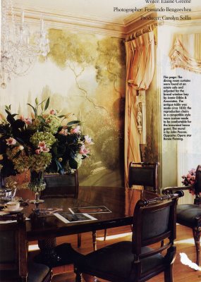
Swept back silk with those cute little london’s in the bay (this is opera’s Renee’ Flemings’ home) window by Jamie Gibbs Assoc.

OMG!!!!! These are the one of the most creative!!!! Inverted pleat with bows!!!!!!!!!!! They just make you smile :-) Susan Schurz.
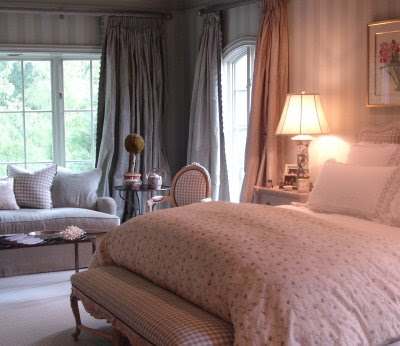
                        With Rods and Rings taking Center stage this box pleat heading is so popular right now!!

Jan Cote

This is luxury, love the leading edge on the panels!  Great Bench!!!!

Christina Azario, so I’ll end here with the luxurious Panels and of course ROMAN SHADES!!!! My favorite…. Hope you’ve had a good time I know I did..

As Always, stay tuned…..

XOXO

M

Read Full Post »

I enjoy entertaining, one of my favorite things to do is to create a beautiful tablescape, I feel so great when guests come into a room and that look of delight comes over them.

This coming weekend is Palm Sunday, so the thought of how to decorate my table was on my mind. I have a beautiful Forsythia bush in my yard that is so beautiful this year, we have had warm weather and it has bloomed early so I thought I could start there.

Color???? Well I usually use a green china that I have for spring, but this year I will not be home for Easter Sunday, I thought we would really set an elegant table with Mother Theresa coming for Palm Sunday dinner. Tradition and faith are a big part of this household (as I’m sure you’ve discovered, if you read my blog), I have my menu planned, and my tablescape already decided.

 To begin, you must make the decision that the iron is your friend, I know, I know we don’t really feel that way but in this case your table should start off with clean crisp linens that are flawlessly ironed. It’s kind of like cooking a great meal the freshest ingredients make the dish, so it goes with a table the linens will shine through all the glamour that will adorn your table.

My choice of plates, black and white china for this occasion I decided to do gold chargers, I love to use chargers I feel that they pull everything together and really add a sense of elegance or whimsy (depending on the occasion).

So here we are Mother Theresa’s silver and a touch of crystal. Wella!!! We are done!!

Now for a full view!

What will you do with your table for Spring. I hope I’ve given some inspiration to you, enjoy the holiday!! As always stay tuned…

XOXO

M

Read Full Post »

Bright colors or mellow hues, color is the key to kick spring into gear!! From rooms in your home to pieces of furniture you want add as an accent, color goes a long way. This is a before and after of my 2010  show house  room.

This is a sad old buffet that my brother-in-law brought to me and said “Wow” isn’t this just great? I was a bit unsure but once it was finished I thought “Wow” this is a great little piece!!!

I primed and painted it blue, sprayed the hardware white and Wella!! My niece Stefanie, is expecting and will use this as her baby’s dresser, we will make a top section for a changing pad and this will be repurposed into a nursery piece, transformed with color!!

A little bit of imagination and elbow grease goes a long way, here is another way to transform a piece of furniture with color.

I recently visited a client who had a corner cabinet. I loved it but it looked a little dated. I immediately thought a quick coat of paint and wrapping paper in the back. This is a great example! What a great background for this cabinet.

One more shot of the same cabinet with a blue quatre foil paper!! Such a different look. What ideas do you have? The possibilities are endless, you can use paint, paper or fabric. Just a little imagination and you too can transform your home for spring!

As Always stay tuned for more color ideas for spring!!

XOXO

M

Read Full Post »

So I’m officially a Certapro blog Junkie, and my friend Ed Mattingly has joined the team as their faux expert. I met Ed a few years back when I did some work for Sherwin Williams. He’s such a great guy and extremely knowledgeable when it comes to decorative finishes and Sherwin Williams Faux products. I enjoyed attending a workshop Ed hosted, he was introducing the new Faux  line of Products from Sherwin Williams. We really had fun working with some of the newer products especially the smooth metallic and venitian plaster!! So easy to apply and great results!

This post was  written  for me, I  love to relate colors to food (who would guess this little italian girl would do that!).  This take on color from our Certapro blog inspired me, so here we go… which is your favorite group?? I’m loving the Berry Rich!

XOXO

M

Read Full Post »

Spring is the perfect time to give your home a fresh look. From serene shades to vivid hues, I have 5 color schemes you’ll want to try this season. Turquoise and tomato red according to some design experts are new hues for this season. I know turquoise??? red????? haven’t these colors been popular for a while?? Well, yes but it is definitely the HUE, that so subtle difference in color that creates new trends, and also the way we pair colors together that creates news. Here is a great example of the new pair that was a color faux pas in the past, pink and red.

Red and Pink spring color pallette

Pink and Red???

Don’t shy away from color this season. Designer Erinn Valencich pairs classic red with hot pink for a bold bedroom design. By using gold and cream in the bedding and wallpaper, she keeps the vibrant shades from overpowering the space.

Clean and Crisp!

Spring hues are ideal for a girl’s bedroom. Using a polka-dot pillow as inspiration, this designer uses a focal wall to set off the room.

Damask fabric in apple green complements the vivid pink wall, while a white headboard and bedding give the space a crisp, fresh look.  I just love Damask, its one of my favorite patterns.

Having two girls of my own, pink is a color that has adorned their rooms for many years, it is always in style for girls, from nursery to teens and beyond.

Bright colors

One of the most appealing shades of spring is the deep blue found in this bedspread. It’s combined with other favorite hues, like tomato red, turquoise and apple green, to create an energetic and bright design.

The mix of patterns here is just exquisite, when pairing patterns small and bold always work with a linear stripe. The pop of white in this headboard again keeps that crisp sharp feeling in the room.

Blue and Yellow

The classic blue and yellow combo is always a favorite. While white is often paired with this palette to keep it light and airy, black accents to create a richer, more sophisticated atmosphere.

Serene Green

Pairing together a calming relaxing green with neutrals are a safer choice and using deeper hues of the same shades as accents, create a great space and inviting atmosphere.

Yellow and Grey

This trend is so popular I have added two pictures for you!! Loving the fresh bright sunshiny yellow paired with the subtle grey!!

Neutrals continue to flourish, as companions for brighter hues or as standalone, monochromatic color schemes.

Which neutral might just surpass brown as the favorite? Gray. And it covers a wide range of hues, which span soft gray to charcoal to hematite, and gain interest from metallic and pearlescent accents.

Green continues to gain strength from its association with the growing shift toward eco-consciousness. It will show up in everything from fabrics to accessories to countertops.

I hope you have enjoyed my forecast on whats new and upcoming in color!! As always stay tuned…..

XOXO

M

Read Full Post »

Lynn and Kevins Home

Base color on this finish is ylang ylang. Other colors used were Metropolitain and Cotswald. The stencil was done in Modern Masters Silver and Lamp Black. So Many layers!!!!! This finish was such fun and the family that I worked with was so great!! Good fun great stories shared. I will update this post shortly with the recipe for this finish and step by step photos. Stay tuned as always!

M

Ylang Ylang Benjamin Moore
AF-305
Meaning “the flower of flowers,” tranquil ylang ylang is a calm, meditative yellow. Like the fragrance of the tropical Asian flower, this shade will relieve stress and anxiety.

Read Full Post »

« Newer Posts - Older Posts »

Jenny Komenda

Design, Fashion and Food!

Just Imagine ExtraOrdinary

Reimagining the ordinary in homes, gardens and our lives.

Your Modern Couple

the design blog you never knew you needed

A Little Bit of Boondock Life

Just another day in the middle of nowhere...

Frugal with a Flourish

Design, Fashion and Food!

Clover Lane

Design, Fashion and Food!

somethingville.com

where my ideas come to life